Fig. 1.
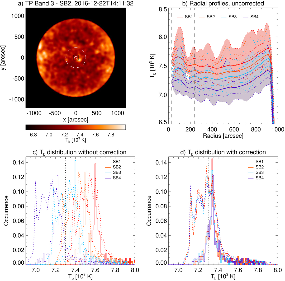
Brightness temperature distribution in the TP Band 3 maps completed at 2016-12-22T14:11:32. (a) Total power map for SB2 (correction following White et al. 2017 applied, i.e. mean value in central region rescaled). The white solid circle in the middle indicates the primary beam of a TP antenna at 3.0 mm and with it the field of view (FOV) of the interferometric observation. The dashed circle has a radius of 240″ and shows the region that is considered for the correction of the absolute brightness temperature scale. The black square shows the central region with 120″ × 120″. (b) Uncorrected radial profiles for all sub-bands in rings 10″ in width. The lines for each sub-band (see colour legend at the top) represent the radial average (solid), average plus or minus the standard deviation (dot-dashed), and the 1st and 99th percentile (dotted). The shaded areas cover the value ranges between the percentiles for SB1 (red) and SB4 (blue). Bottom row: histograms for the brightness temperature distribution within the black square (solid histograms) and within the white dashed circle (dotted histograms, scaled by a factor of 3) for all sub-bands (c) without and (d) with correction to the reference value suggested by White et al. (2017) (vertical black dotted line).
Current usage metrics show cumulative count of Article Views (full-text article views including HTML views, PDF and ePub downloads, according to the available data) and Abstracts Views on Vision4Press platform.
Data correspond to usage on the plateform after 2015. The current usage metrics is available 48-96 hours after online publication and is updated daily on week days.
Initial download of the metrics may take a while.