Fig. 14.
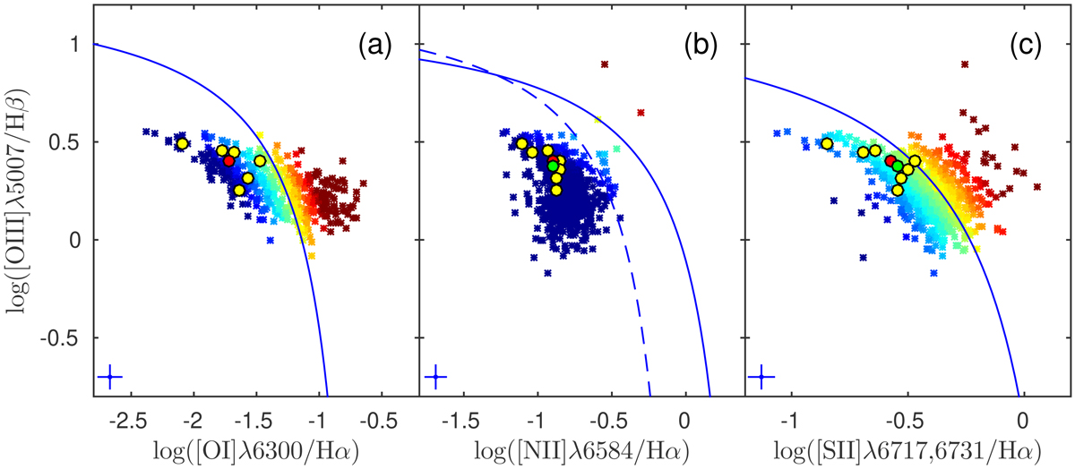
Optical emission-line diagnostic diagram for the individual spaxels in Mrk 900; the ratio for the SF regions identified in the galaxy and for the nuclear and integrated spectrum are also shown in the plot (yellow, red, and green circles represent the SF regions, the nuclear, and the integrated spectrum, respectively). The solid black line in the panels delineates the theoretical “maximum starburst line” derived by Kewley et al. (2001); the dashed black curve in panelb traces the Kauffmann et al. (2003) empirical classification line. To better visualize the results on the diagram, the points are color-coded according to their distance to the maximum starburst line. In both diagrams, the lower-left section of the plot is occupied by spaxels in which the dominant energy source is the radiation from hot stars (blue points in the figure). Additional ionizing mechanisms shift the spaxels to the top right and right part of the diagrams (from yellow to red).
Current usage metrics show cumulative count of Article Views (full-text article views including HTML views, PDF and ePub downloads, according to the available data) and Abstracts Views on Vision4Press platform.
Data correspond to usage on the plateform after 2015. The current usage metrics is available 48-96 hours after online publication and is updated daily on week days.
Initial download of the metrics may take a while.