Fig. 5.
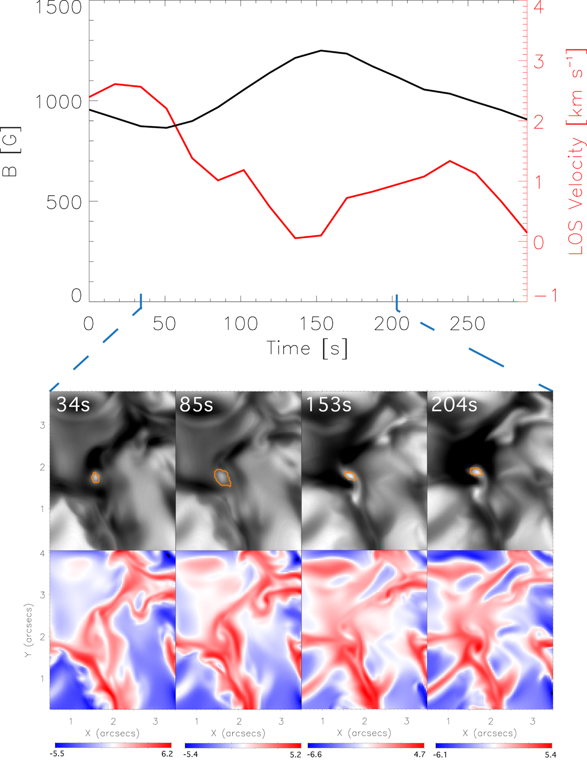
Example of convective collapse from the MURaM simulations. Top plot: evolution of the magnetic field in the vertical direction (black) with the evolution of the LOS velocity (red), where positive velocity values indicate a downflow. The panels below show the evolution of the MBP in intensity (top rows) and LOS velocity (bottom row) for the time frame indicated by the blue dashed lines. Orange contours in the intensity images show the MBP, as tracked by our algorithm, used to make the evolution plots above. The LOS velocity peaks ∼136 s prior to the peak in magnetic field. It can be seen in the intensity images that the MBP reduces in size in this period of time and the intensity increases, which is indicative of convective collapse.
Current usage metrics show cumulative count of Article Views (full-text article views including HTML views, PDF and ePub downloads, according to the available data) and Abstracts Views on Vision4Press platform.
Data correspond to usage on the plateform after 2015. The current usage metrics is available 48-96 hours after online publication and is updated daily on week days.
Initial download of the metrics may take a while.