Fig. 4
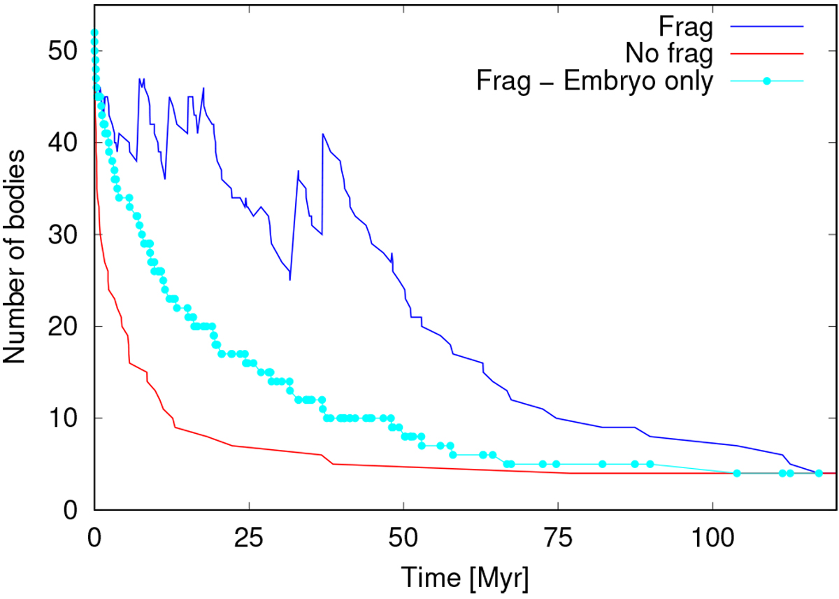
Number of remaining bodies vs. integration time. The red curve corresponds to a simulation that lead to perfect mergers. The blue and cyan curves represent a simulation with the realistic collision treatment. In particular, the cyan curve only shows the decrease of planetary embryos. Both curves (red and blue) are representative for each set of simulations.
Current usage metrics show cumulative count of Article Views (full-text article views including HTML views, PDF and ePub downloads, according to the available data) and Abstracts Views on Vision4Press platform.
Data correspond to usage on the plateform after 2015. The current usage metrics is available 48-96 hours after online publication and is updated daily on week days.
Initial download of the metrics may take a while.