Fig. 2
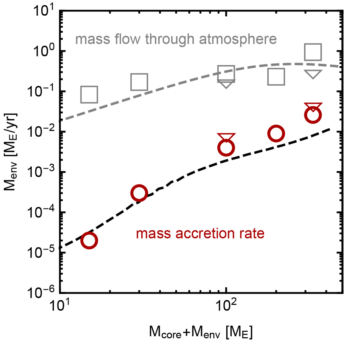
Gas accretion rates as function of planetary mass. Red circles indicate mass accretion rates obtained from the hydrodynamical simulations, for each of the different planetary masses we probed. Grey squares represent the measured mass flux through the outer envelope, measured through the Hill sphere. Grey and red triangles correspond to results from our highest resolution runs (run100HR,run330HR). The black dashed curve shows the evolution of the mass accretion rate obtained with a simplified 1D model in order to capture the long-term evolution. The grey dashed line shows Eq. (2), where we included the turn-over around one Jupiter mass as in Tanigawa & Ikoma (2007). We found this expression corresponds well with the bulk mass flux through the envelope, but not with the gas accretion rate.
Current usage metrics show cumulative count of Article Views (full-text article views including HTML views, PDF and ePub downloads, according to the available data) and Abstracts Views on Vision4Press platform.
Data correspond to usage on the plateform after 2015. The current usage metrics is available 48-96 hours after online publication and is updated daily on week days.
Initial download of the metrics may take a while.