Fig. 4
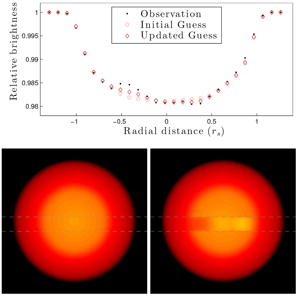
Sketching the method for mapping stellar surfaces, part 4: averaging stellar maps. Upper panel: the observed light curve is shown as black dots (this is the exact same data as are shown in Fig. 3). The light curve that the initial guess for stellar surface produces is shown as pink circles. The light curve that the updated map produces is shown as red diamonds. Lower row: maps of the stellar surface. To the left is the initial guess for the stellar surface, based on Iref. Dashed graylines shows the transit chord. To the right is the updated guess for the stellar surface created from averaging the maps from each individual exposure from Fig. 3. The contrast of the spots has been increased for better visibility.
Current usage metrics show cumulative count of Article Views (full-text article views including HTML views, PDF and ePub downloads, according to the available data) and Abstracts Views on Vision4Press platform.
Data correspond to usage on the plateform after 2015. The current usage metrics is available 48-96 hours after online publication and is updated daily on week days.
Initial download of the metrics may take a while.