Fig. 3
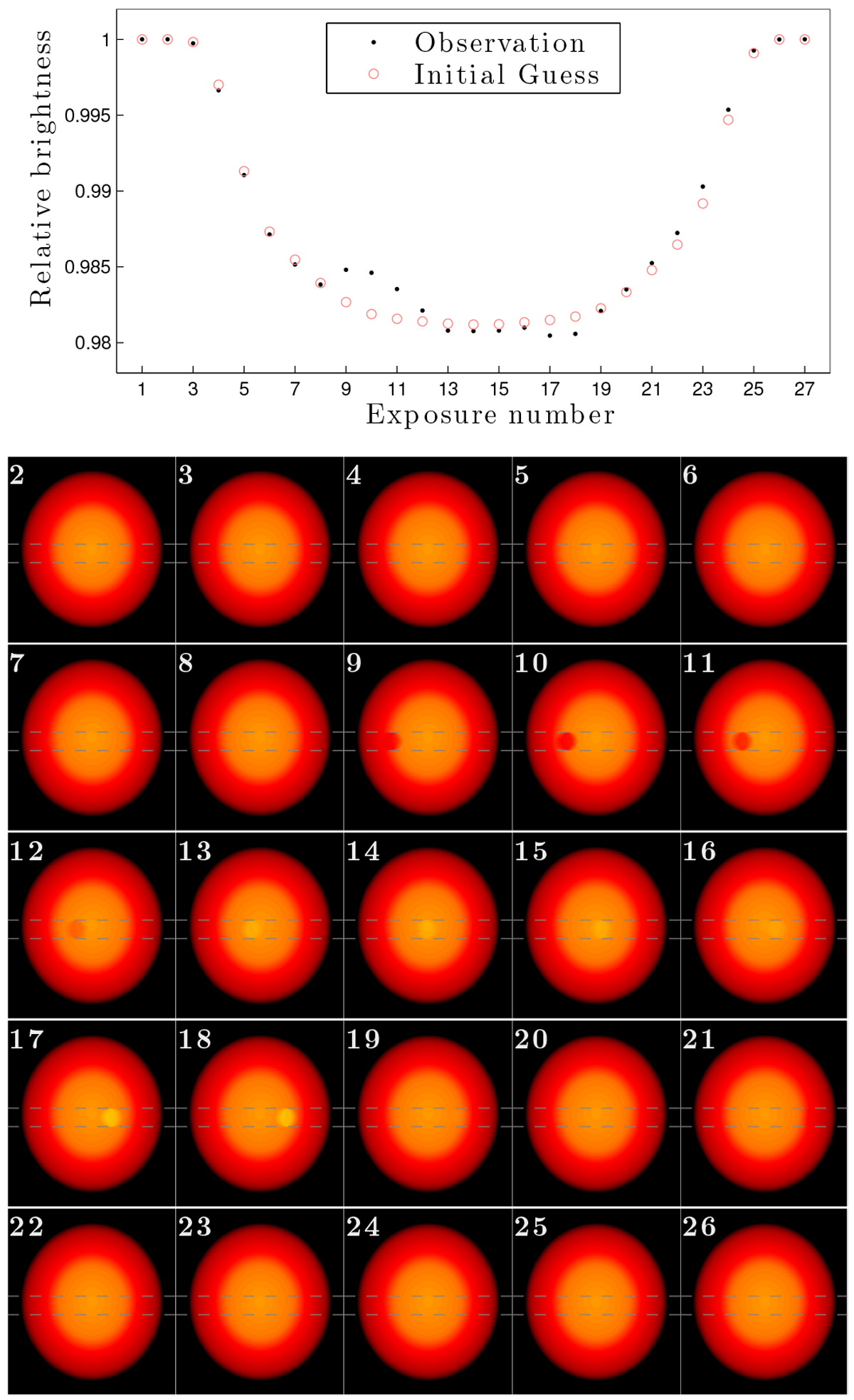
Sketching the method for mapping stellar surfaces, part 3: mapping individual exposures. Upper panel: light curves that this sketch is based on. The observed data are shown as black dots (there is no noise in this example). The synthetic light curve produced by the initial guess for the stellar surface is shown as pink circles. Lower five rows: 25 maps of the stellar surface. Each shows the updated guess for the brightness distribution based on only the one exposure that corresponds to the number in the upper left corner of each figure. Dashed gray lines show the transit chord. For example, the predicted brightness (pink circles) in exposure 11 is lower than the observed brightness (black dots). This is interpreted as a dark spot on the stellar surface below the planet. In the updated map corresponding to exposure 11, the brightness of the stellar surface at the position of the planet in this exposure is decreased.
Current usage metrics show cumulative count of Article Views (full-text article views including HTML views, PDF and ePub downloads, according to the available data) and Abstracts Views on Vision4Press platform.
Data correspond to usage on the plateform after 2015. The current usage metrics is available 48-96 hours after online publication and is updated daily on week days.
Initial download of the metrics may take a while.