Fig. 6
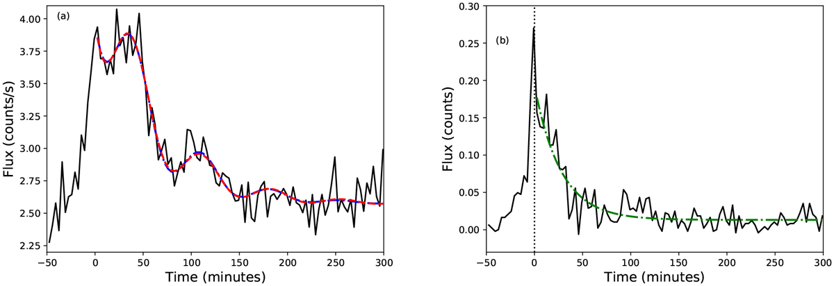
Panel a: flare lightcurve (black, solid) for data observed between 0.5 and 1.0 keV. The red, dashed line shows the fit when the decay of the sinusoid was described by an exponential, while the blue, dot-dashed curved shows the fit when the decay of the sinusoid was described by a Gaussian. We note that the blue and red curves are almost identical and, therefore, difficult to distinguish. Panel b: flare lightcurve (black, solid) for data observed between 4.5 and 12.0 keV. No good fitcontaining QPPs was obtained for this data set and so the green dot-dashed line shows the best fitting exponential decay as described by Eq. (1).
Current usage metrics show cumulative count of Article Views (full-text article views including HTML views, PDF and ePub downloads, according to the available data) and Abstracts Views on Vision4Press platform.
Data correspond to usage on the plateform after 2015. The current usage metrics is available 48-96 hours after online publication and is updated daily on week days.
Initial download of the metrics may take a while.