Fig. 12
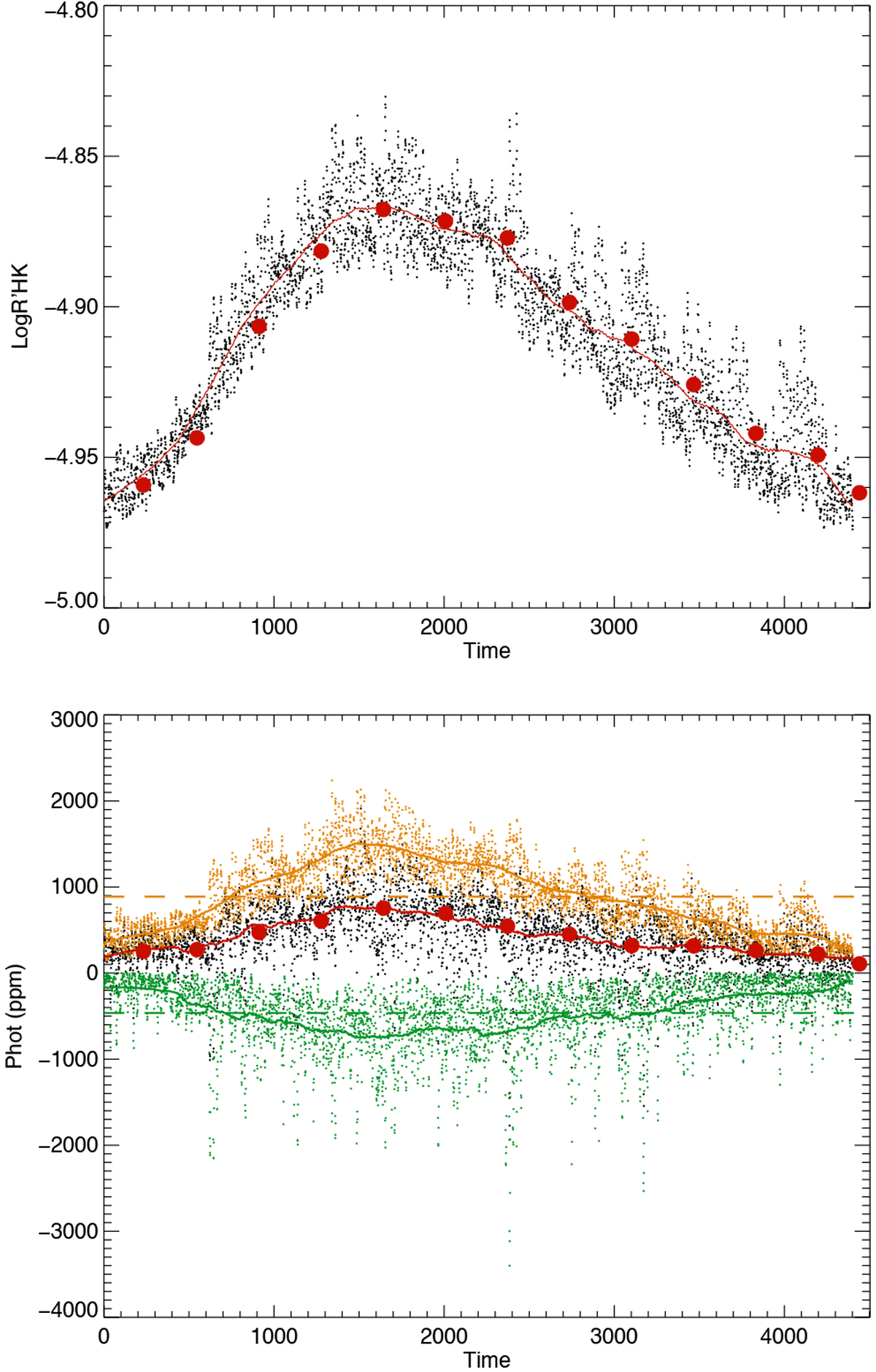
Log ![]() (upper panel) and Itot (lower panel) vs. time. Upper panel: Log
(upper panel) and Itot (lower panel) vs. time. Upper panel: Log ![]() vs. time for a moderately active G2 star, seen edge-on (black dots). The red curves is the smoothed (over one year) series, and the red points are yearly averages. Lower panel: same for
Itot vs. time. The orange dots only represent the plage contribution (the dashed orange line indicates the average level), and the green dots represent the spot contribution (the horizontal dashed green lines indicates the average level) for ΔTspot1.
vs. time for a moderately active G2 star, seen edge-on (black dots). The red curves is the smoothed (over one year) series, and the red points are yearly averages. Lower panel: same for
Itot vs. time. The orange dots only represent the plage contribution (the dashed orange line indicates the average level), and the green dots represent the spot contribution (the horizontal dashed green lines indicates the average level) for ΔTspot1.
Current usage metrics show cumulative count of Article Views (full-text article views including HTML views, PDF and ePub downloads, according to the available data) and Abstracts Views on Vision4Press platform.
Data correspond to usage on the plateform after 2015. The current usage metrics is available 48-96 hours after online publication and is updated daily on week days.
Initial download of the metrics may take a while.