Fig. 9
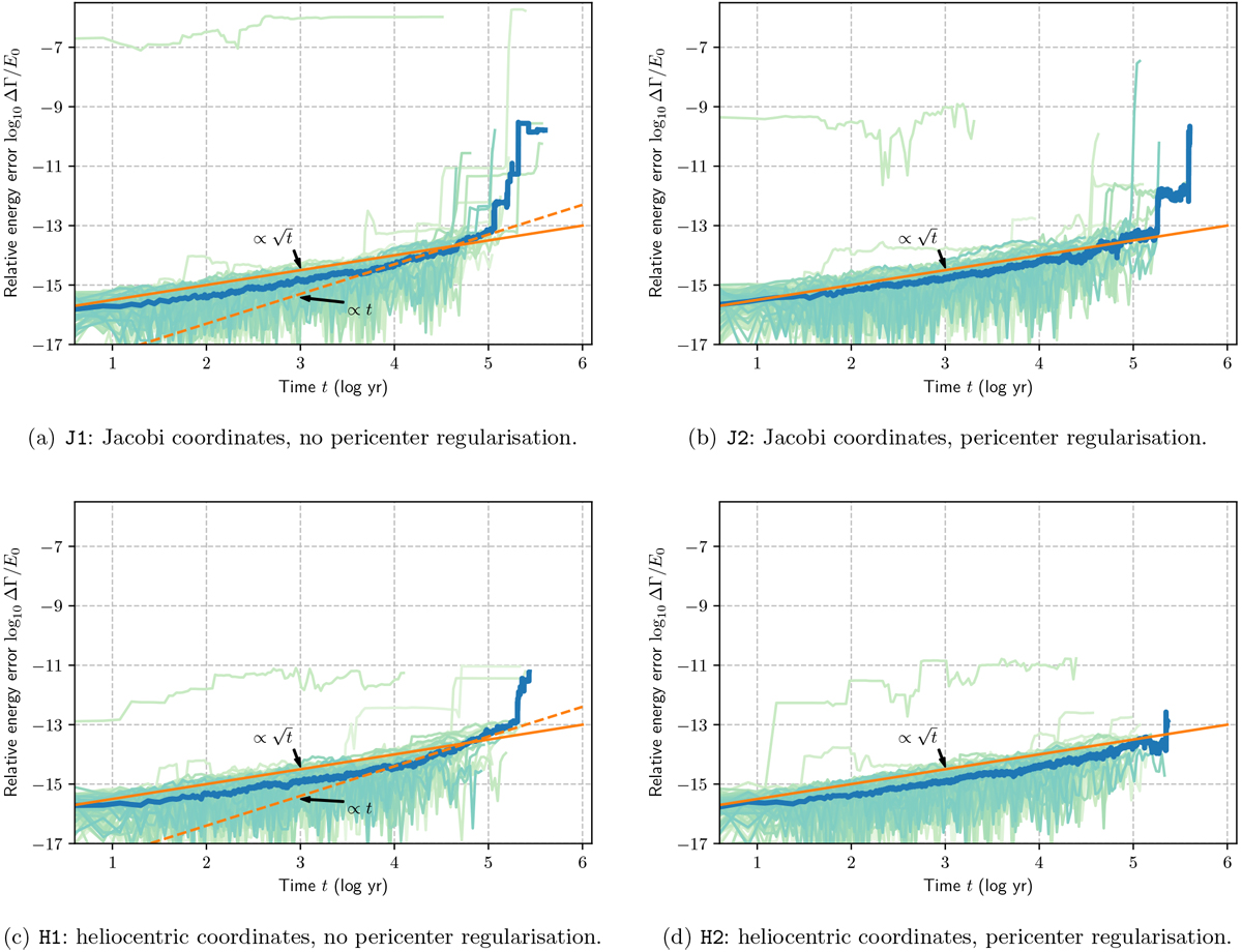
Evolution of the energy error for the four runs detailed in the text and Table 1. The light curves represent individual systems, and the thicker blue curves show the medians over the 100 systems. The orange filled lines are proportional to ![]() and are the same in all energy error figures for comparison. The dashed orange lines represents a linear error in time to show the deviation from the Brouwer law. We discuss the outliers in the main text.
and are the same in all energy error figures for comparison. The dashed orange lines represents a linear error in time to show the deviation from the Brouwer law. We discuss the outliers in the main text.
Current usage metrics show cumulative count of Article Views (full-text article views including HTML views, PDF and ePub downloads, according to the available data) and Abstracts Views on Vision4Press platform.
Data correspond to usage on the plateform after 2015. The current usage metrics is available 48-96 hours after online publication and is updated daily on week days.
Initial download of the metrics may take a while.