Free Access
Fig. 1
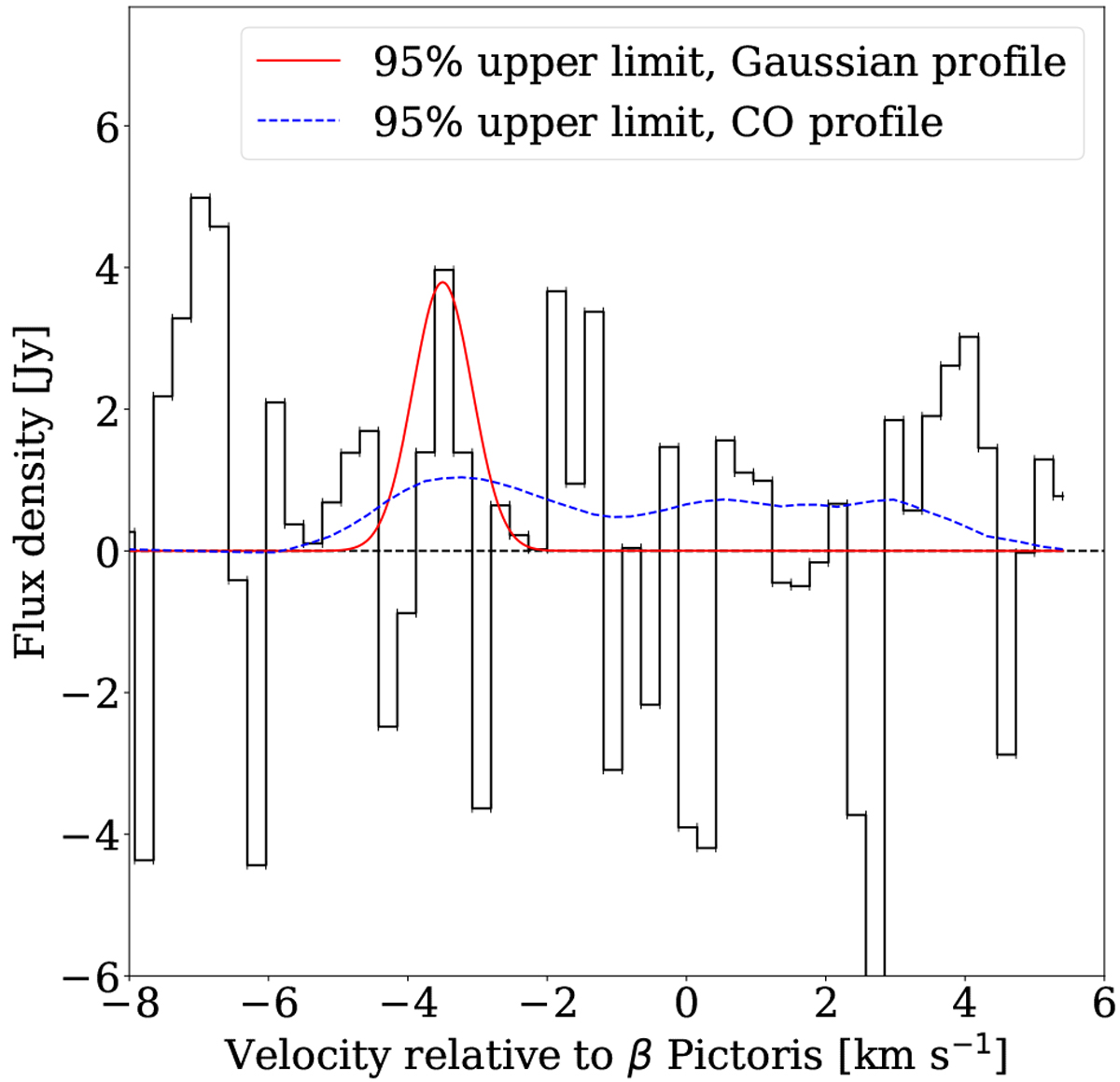
95% upper limit models superimposed on the observed spectrum. The red solid line shows the expected profile coming from H2O restricted to the SW clump. The blue dashed line shows the profile from the model assuming the same spatial distribution for H2O as for CO (see Sect. 5).
Current usage metrics show cumulative count of Article Views (full-text article views including HTML views, PDF and ePub downloads, according to the available data) and Abstracts Views on Vision4Press platform.
Data correspond to usage on the plateform after 2015. The current usage metrics is available 48-96 hours after online publication and is updated daily on week days.
Initial download of the metrics may take a while.