Fig. 12
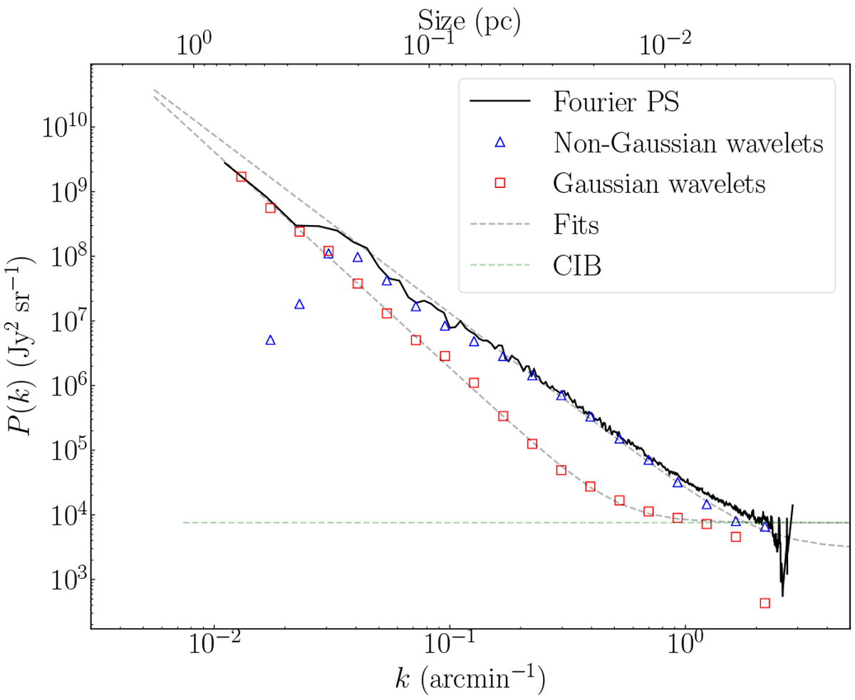
Segmented power spectra for the Polaris flare map at 250 μm. The total Fourier power spectrum is represented by the solid black line. The red diamonds show the power spectrum for the Gaussian self-similar part of the map. The blue triangles show the power spectrum for the non-Gaussian coherent part of the map. The black dashed line represents the fits of the curves and the green dashed line represents the CIB and sources contribution level. The fit values are listed in Table 3.
Current usage metrics show cumulative count of Article Views (full-text article views including HTML views, PDF and ePub downloads, according to the available data) and Abstracts Views on Vision4Press platform.
Data correspond to usage on the plateform after 2015. The current usage metrics is available 48-96 hours after online publication and is updated daily on week days.
Initial download of the metrics may take a while.