Fig. 3.
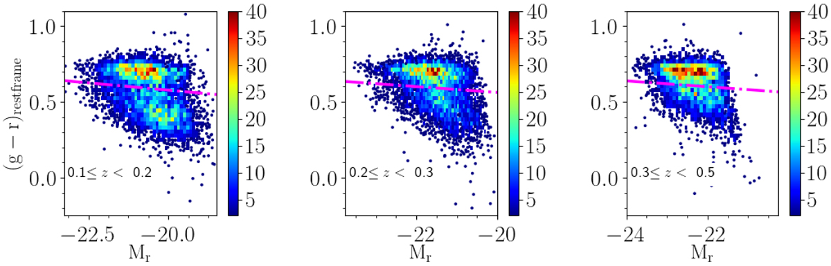
Colour–magnitude diagrams in the magnitude limited sample in the three redshift bins analysed, with increasing redshift from left to right as indicated in the labels. Single galaxies are plotted as blue dots, while galaxies in higher density regions are grouped together and plotted as rectangles colour-coded according to their number density as indicated in the colour bar located on the side of each panel. The magenta dotted line shows the separation between red and blue objects using the (g − r)rest-frame colour.
Current usage metrics show cumulative count of Article Views (full-text article views including HTML views, PDF and ePub downloads, according to the available data) and Abstracts Views on Vision4Press platform.
Data correspond to usage on the plateform after 2015. The current usage metrics is available 48-96 hours after online publication and is updated daily on week days.
Initial download of the metrics may take a while.