Fig. 7
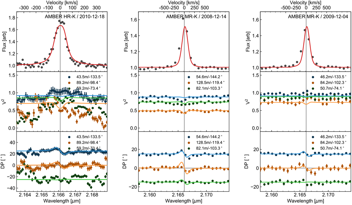
Comparisons of our observed interferometric data (coloured points) with synthesized data from our kinematic model (solid lines). Our AMBER HR data is shown in the left panel; our two AMBER MR epochs are shown in the middle and right panels. Each plot shows the spectrum (top panels), squared visibilities (middle panels), and differential phases (lower panels) calculated from our kinematic model and compared to our observed VLTI/AMBER data. The different coloured lines correspond to the different observed baselines, which are labelled in the upper right corner of the panel.
Current usage metrics show cumulative count of Article Views (full-text article views including HTML views, PDF and ePub downloads, according to the available data) and Abstracts Views on Vision4Press platform.
Data correspond to usage on the plateform after 2015. The current usage metrics is available 48-96 hours after online publication and is updated daily on week days.
Initial download of the metrics may take a while.