Fig. 6.
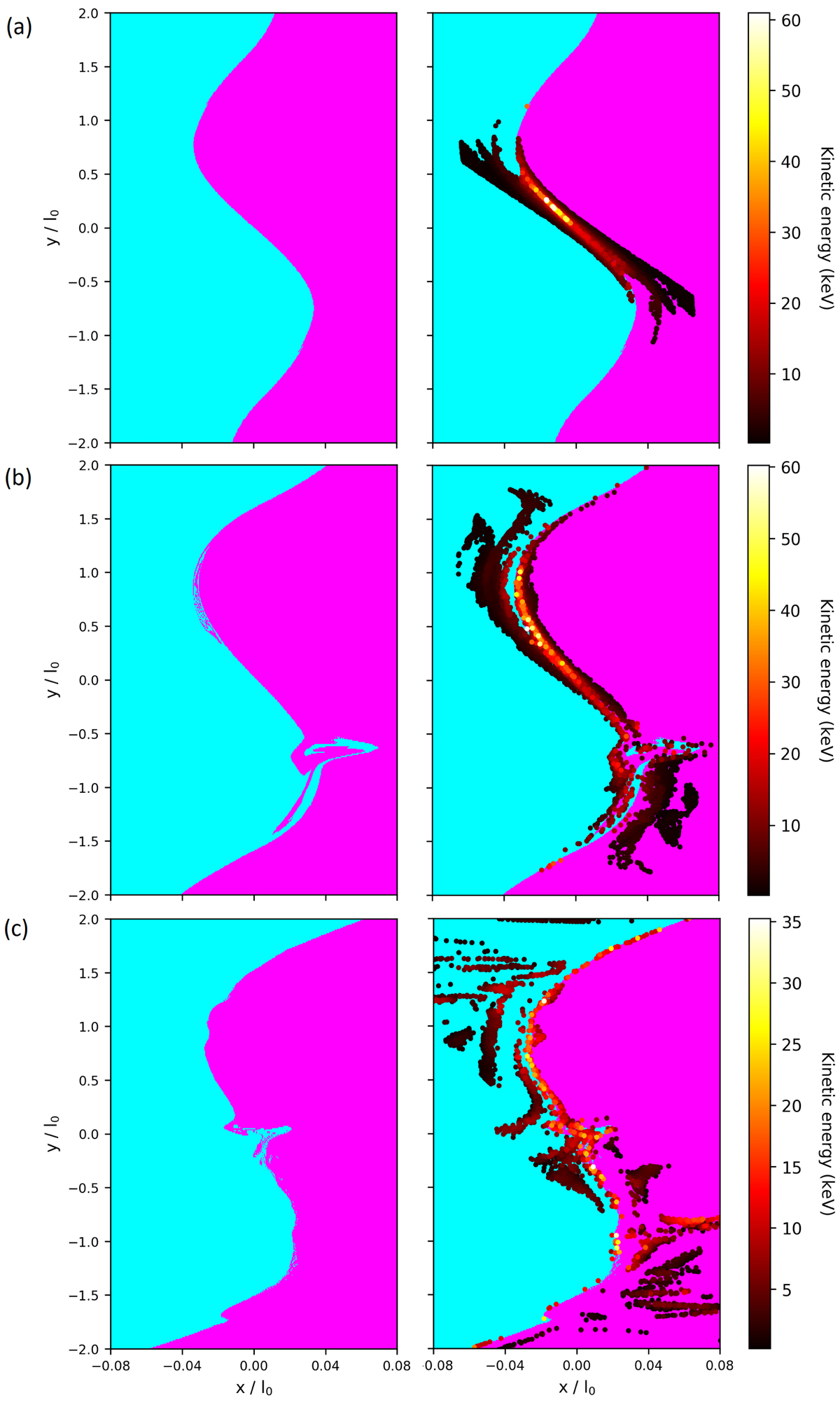
Connectivity plots at z = +1.0 with impact distributions overlaid for t = 8 (panel a), t = 16 (panel b), t = 21 (panel c). The connectivity maps are produced by integrating a large number of field lines from a grid of points in the given plane, and colouring the corresponding point according to which boundary the field line intersects. The cyan regions are magnetically connected to the −x domain boundary and the magenta regions are connected the +x domain boundary.
Current usage metrics show cumulative count of Article Views (full-text article views including HTML views, PDF and ePub downloads, according to the available data) and Abstracts Views on Vision4Press platform.
Data correspond to usage on the plateform after 2015. The current usage metrics is available 48-96 hours after online publication and is updated daily on week days.
Initial download of the metrics may take a while.