Fig. 5.
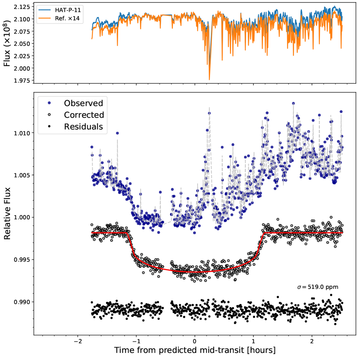
GTC/OSIRIS HAT-P-11b white light transit curve for the night of August 30, 2016. Top panel: measured flux vs. time of HAT-P-11 and the reference star; the flux of the reference was multiplied by a factor of 14 for visualization purposes. Bottom panel: blue points represent the observed time series, the gray dashed line shows the best-fit model (transit model plus systematics and red noise) determined using our MCMC analysis, the black open circles show the light curve after removing the systematic effects and red noise component, while the red line is the best-fitting transit model. All the curves are shown with an arbitrary offset in y-axis.
Current usage metrics show cumulative count of Article Views (full-text article views including HTML views, PDF and ePub downloads, according to the available data) and Abstracts Views on Vision4Press platform.
Data correspond to usage on the plateform after 2015. The current usage metrics is available 48-96 hours after online publication and is updated daily on week days.
Initial download of the metrics may take a while.