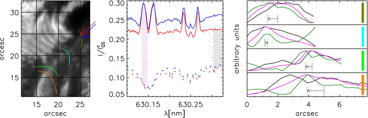
Fig. 12.
Left panel: continuum intensity map with the streamlines of the transversal component of the magnetic field indicated by orange, green, cyan, and olive lines. The blue and red arrows indicate the pixels displayed in the middle panel. Middle panel: Stokes I profiles observed during the flare (solid lines) and post-WLF phase (dashed lines). The shaded areas give the range of wavelengths used to compute the average intensity difference between the Stokes I profiles observed during the flare and post-WLF phase. Right panel: continuum and line intensifications (black and pink lines) for pixels along the streamlines plotted in the left panel; the green lines correspond to the difference. For display purposes, the maxima and minima of these lines are normalised to the same range. The thick coloured vertical lines on the right of the plots show the respective streamline colours. The thin vertical black and green lines show the local maxima of black and green lines, respectively. The arrows connecting them indicate the shift of these maxima. The zero on the x-axis corresponds to the upper-left ends of the streamlines in the left panel.
Current usage metrics show cumulative count of Article Views (full-text article views including HTML views, PDF and ePub downloads, according to the available data) and Abstracts Views on Vision4Press platform.
Data correspond to usage on the plateform after 2015. The current usage metrics is available 48-96 hours after online publication and is updated daily on week days.
Initial download of the metrics may take a while.