Fig. A.2.
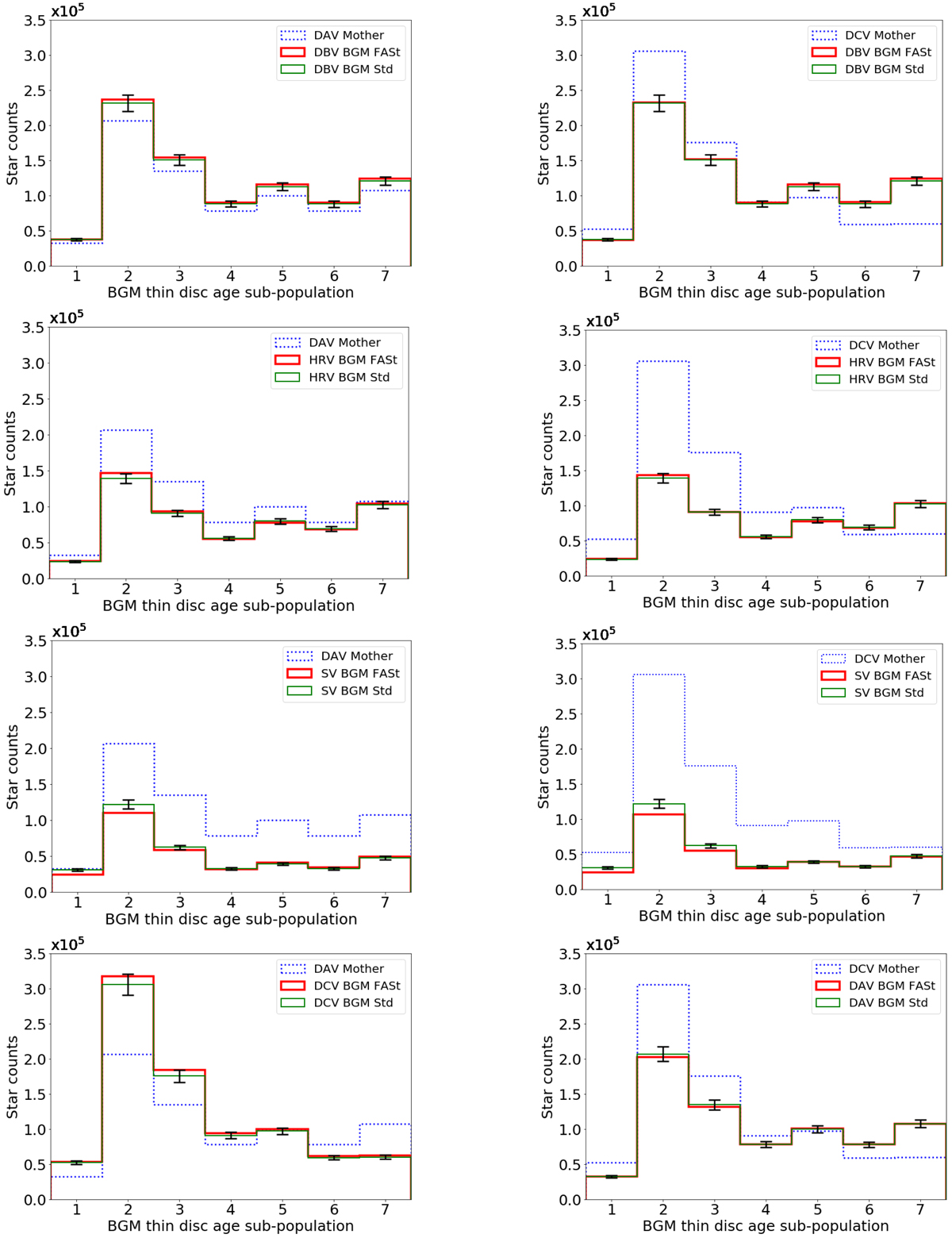
Age sub-population distribution for the BGM FASt vs. BGM Std tests presented in Table 2. All the plotted simulations use the Drimmel & Spergel (2001) extinction map. The blue dotted line is for the Mother Simulation (DAV variant for the first column and DCV variant for the second column). The thin green line and the thick red line signify BGM Std and BGM FASt simulations, respectively. The error bars are set to be 5% of the stars in the bin to visualise if the differences are below or above it.
Current usage metrics show cumulative count of Article Views (full-text article views including HTML views, PDF and ePub downloads, according to the available data) and Abstracts Views on Vision4Press platform.
Data correspond to usage on the plateform after 2015. The current usage metrics is available 48-96 hours after online publication and is updated daily on week days.
Initial download of the metrics may take a while.