Fig. 6.
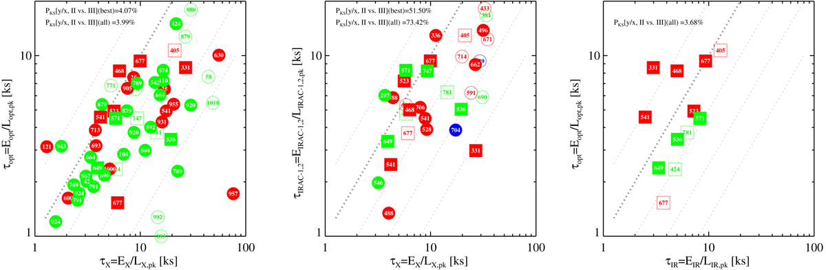
Comparisons between the duration of flares in different bands. The three panels show all three possible comparison between the X-ray, optical, and mIR bands. Duration are defined as described in the text, as the ratio between integrated energy and peak luminosity. Flares plotted as squares are those observed in all three bands. The remaining symbols and colors are as in Figs. 3 and 4. The thick gray diagonal line indicates the unit relation. Thinner lines deviations by factors of 0.5, 2.0, 4.0, and 8.0. The results of KS tests comparing the distributions of the ratios of the two plotted quantities for flares from Class II and Class III sources are shown in the upper-left corner, both for the higher quality flares (filled symbols) and for all flares. The null probabilities reported do not evidence any significant difference.
Current usage metrics show cumulative count of Article Views (full-text article views including HTML views, PDF and ePub downloads, according to the available data) and Abstracts Views on Vision4Press platform.
Data correspond to usage on the plateform after 2015. The current usage metrics is available 48-96 hours after online publication and is updated daily on week days.
Initial download of the metrics may take a while.