Fig. 7
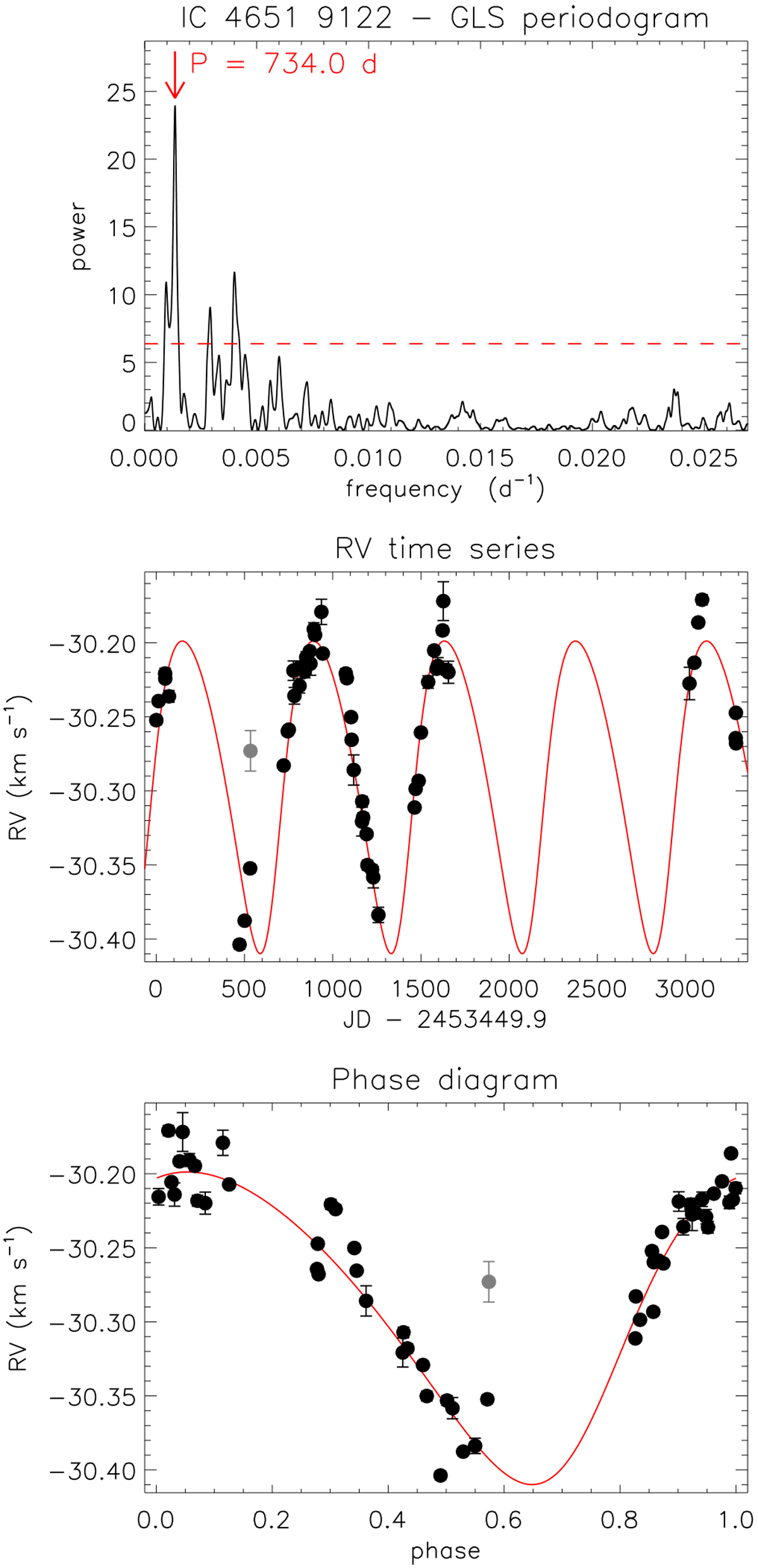
RV analysis of IC 4651 9122. Top panel: GLS periodogram of the RV time series showing the most prominent peak period. The red horizontal dashed line illustrates the 1% FAP level. Middle panel: RVtime series, where the black circles and error bars are the HARPS data and the red curve is the best Keplerian fit to the data. The gray colored data point is a particular outlier with a S∕N = 10.3, namely very close to the threshold (S∕N = 10.0) defined in this work. We discarded it in this analysis. Bottom panel: phase diagram of the RV time series for the orbital period of the best fit (see Table 4). The symbols are as in the middle panel.
Current usage metrics show cumulative count of Article Views (full-text article views including HTML views, PDF and ePub downloads, according to the available data) and Abstracts Views on Vision4Press platform.
Data correspond to usage on the plateform after 2015. The current usage metrics is available 48-96 hours after online publication and is updated daily on week days.
Initial download of the metrics may take a while.