Fig. 7.
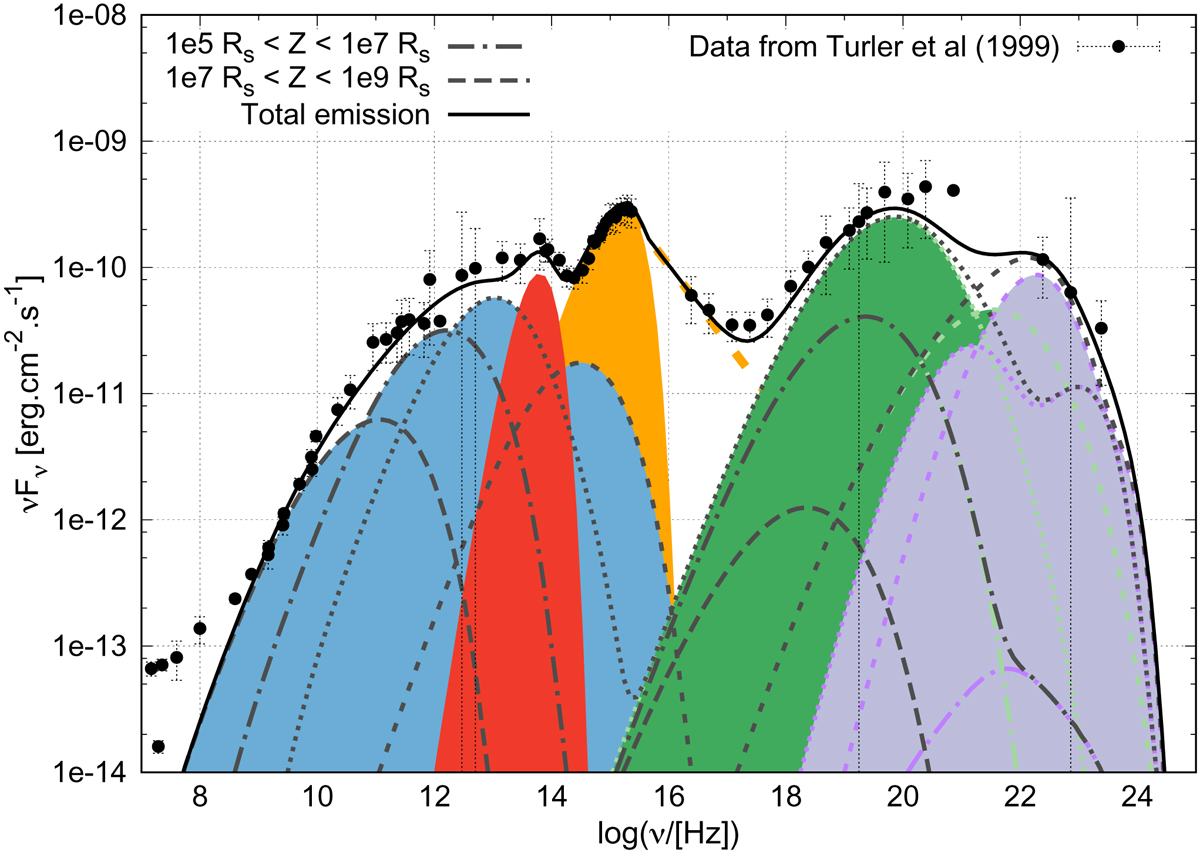
SED of 3C 273 – modelling compared to data from Turler et al. (1999). The synchrotron emission is shown in blue, the SSC in green, and the external Compton in purple. The torus emission is shown in red and the multicolor accretion disc in orange (filled orange curve), complete with a power-law describing the hot corona emission between 0.02 and 200 keV (dashed orange line). Different emission zones in the jet are represented with different dotted lines. The emission below 109 Hz not reproduced by the model is interpreted as the emission from the jet hot spot, not modelled here.
Current usage metrics show cumulative count of Article Views (full-text article views including HTML views, PDF and ePub downloads, according to the available data) and Abstracts Views on Vision4Press platform.
Data correspond to usage on the plateform after 2015. The current usage metrics is available 48-96 hours after online publication and is updated daily on week days.
Initial download of the metrics may take a while.