Fig. 5
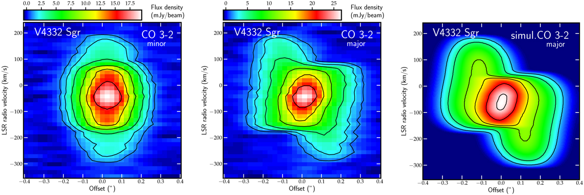
Position-velocity diagrams of V4332 Sgr. The diagrams represent the entire emission of CO (image and contours) along the minor (left panel) and major (middle panel) axis of the region. The left and middle panels are based on ALMA observations while the right panel shows a sample diagram extracted along the longer axis of the CO emission region simulated inShape (Steffen et al. 2011). The contours are drawn at 5, 10, 20, 40, 60, and 80% of the observed emission peak. The contours of the Shape simulation are drawn at 10, 20, 45, 60, 80, and 97% of the peak.
Current usage metrics show cumulative count of Article Views (full-text article views including HTML views, PDF and ePub downloads, according to the available data) and Abstracts Views on Vision4Press platform.
Data correspond to usage on the plateform after 2015. The current usage metrics is available 48-96 hours after online publication and is updated daily on week days.
Initial download of the metrics may take a while.