Fig. 2.
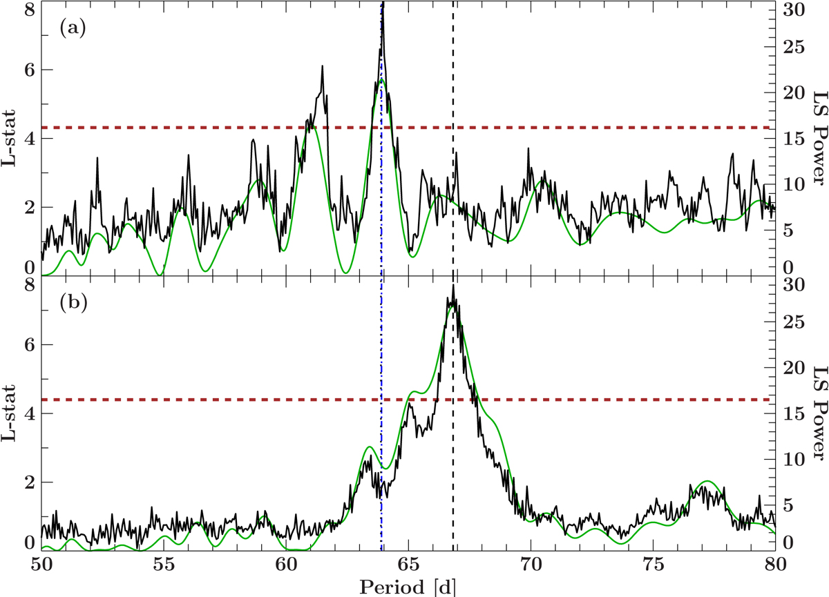
Panel a: epoch-folding (black, left y-axis) and Lomb–Scargle Periodogram (green, right y-axis) of all Swift/UVOT data. Panel b: same as panel a but for the Swift/XRT data. The dotted vertical line marks the strongest period of the UVOT data (which is consistent with the implied orbital period from the pulse period analysis), the dashed line the period of the XRT data. The dashed horizontal line marks the 99.9% false alarm probability of the epoch folding results based on an F-distribution corrected for number of trial periods (Davies 1990).
Current usage metrics show cumulative count of Article Views (full-text article views including HTML views, PDF and ePub downloads, according to the available data) and Abstracts Views on Vision4Press platform.
Data correspond to usage on the plateform after 2015. The current usage metrics is available 48-96 hours after online publication and is updated daily on week days.
Initial download of the metrics may take a while.