Fig. 9
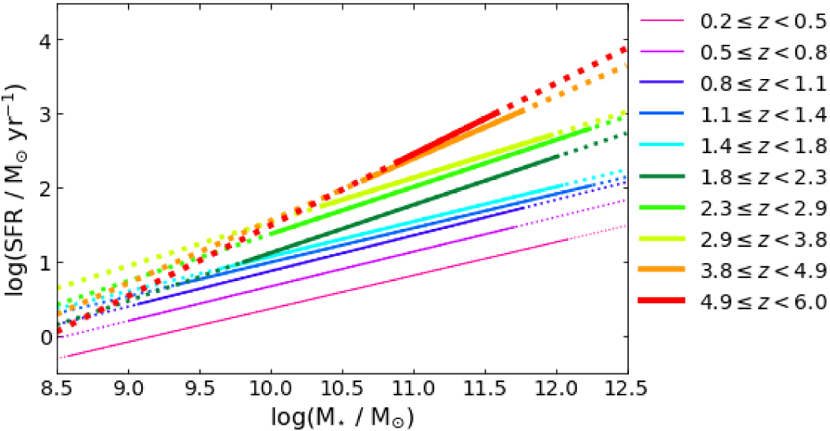
Fitted MS trends using Eq. (8). The solid and dashed lines are the MS across the fittedM⋆ range. The dotted lines are extrapolations across the M⋆ range of the plot. The normalisation of the MS clearly increases as redshift increases. The slight decrease in slope at low redshift can be seen along with the increase above z = 1.1. The very steep slopes at 1.8 ≤ z < 2.9 can also be seen.
Current usage metrics show cumulative count of Article Views (full-text article views including HTML views, PDF and ePub downloads, according to the available data) and Abstracts Views on Vision4Press platform.
Data correspond to usage on the plateform after 2015. The current usage metrics is available 48-96 hours after online publication and is updated daily on week days.
Initial download of the metrics may take a while.