Fig. 8
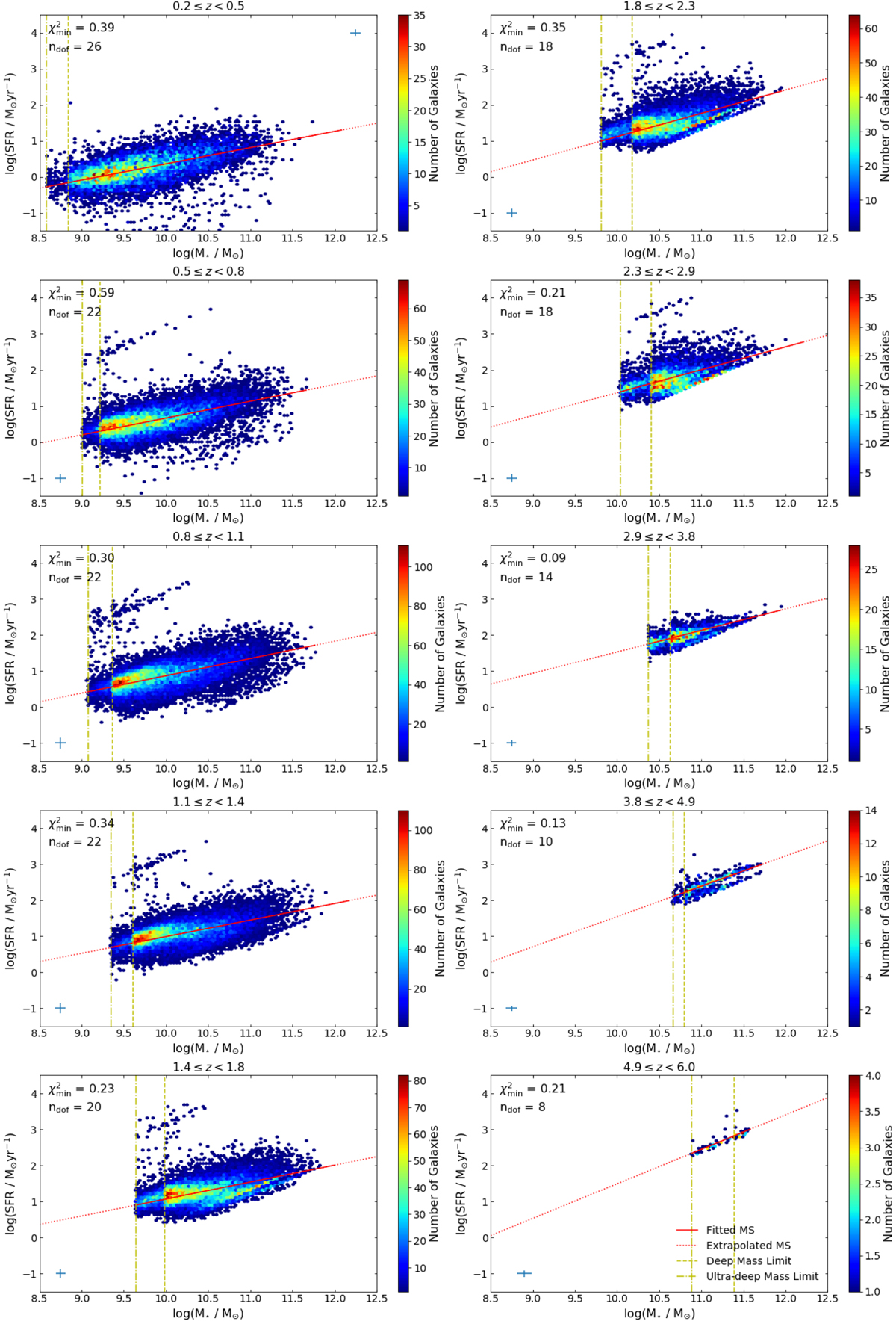
Fitting of Eq. (8) to the objects in the redshift bins as labelled. The solid line is the most likely MS across the fitted M⋆ range, while the dotted line is an extrapolation across the M⋆ range of theplot. The galaxies are shown as a number density plot, with dark red being high number density and dark blue low number density. The vertical density discontinuities are the result of the two depths of data used: the deep mass limit is the yellow dashed line and the ultra-deep mass limit is the dot-dashed yellow line. Each panel also indicates the χ2 of the most likely MS (![]() ) and the number of degrees of freedom in the fitting (ndof), and shows the size of the average SFR and M⋆
errors as a blue cross.
) and the number of degrees of freedom in the fitting (ndof), and shows the size of the average SFR and M⋆
errors as a blue cross.
Current usage metrics show cumulative count of Article Views (full-text article views including HTML views, PDF and ePub downloads, according to the available data) and Abstracts Views on Vision4Press platform.
Data correspond to usage on the plateform after 2015. The current usage metrics is available 48-96 hours after online publication and is updated daily on week days.
Initial download of the metrics may take a while.