Fig. 6
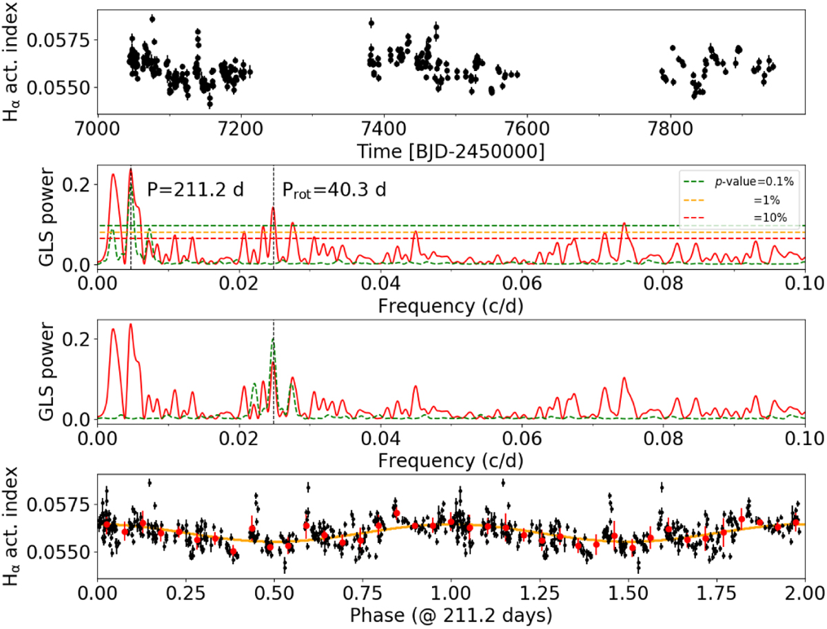
Top plot: time series of the activity indicator based on the Hα line extracted from the HARPS and HARPS-N spectra. Second and third plots: GLS periodogram of the dataset is shown. The dashed horizontal lines indicate the p-value levels as derived from a bootstrap analysis. The greencurve corresponds to the window function of the measurements, which is shifted in frequency so that the peak is superimposed on the major peak of the RV periodogram (second plot), to directly identify alias frequencies. In the third plot the window function is shifted to be superimposed on the P ~ 40 days rotational signal. Bottom: time series phase-folded at the period P = 211 days. Red points represent the average of the data within 20 bins in the phase range [0,1].
Current usage metrics show cumulative count of Article Views (full-text article views including HTML views, PDF and ePub downloads, according to the available data) and Abstracts Views on Vision4Press platform.
Data correspond to usage on the plateform after 2015. The current usage metrics is available 48-96 hours after online publication and is updated daily on week days.
Initial download of the metrics may take a while.