Fig. 25
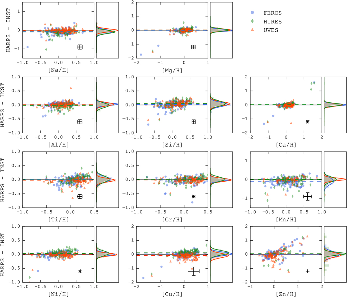
Comparison between the abundances obtained with spectra from different instruments, with respect to the values obtained with HARPS spectra. The y-axis for each panel corresponds to the difference between the values from HARPS, and from FEROS (blue squares), UVES (red triangles), and HIRES (green diamonds). The right-hand plots show the distribution of the values, along with their Gaussian distribution fit. The black points in the bottom right of each plot represents the average uncertainty in the points.
Current usage metrics show cumulative count of Article Views (full-text article views including HTML views, PDF and ePub downloads, according to the available data) and Abstracts Views on Vision4Press platform.
Data correspond to usage on the plateform after 2015. The current usage metrics is available 48-96 hours after online publication and is updated daily on week days.
Initial download of the metrics may take a while.