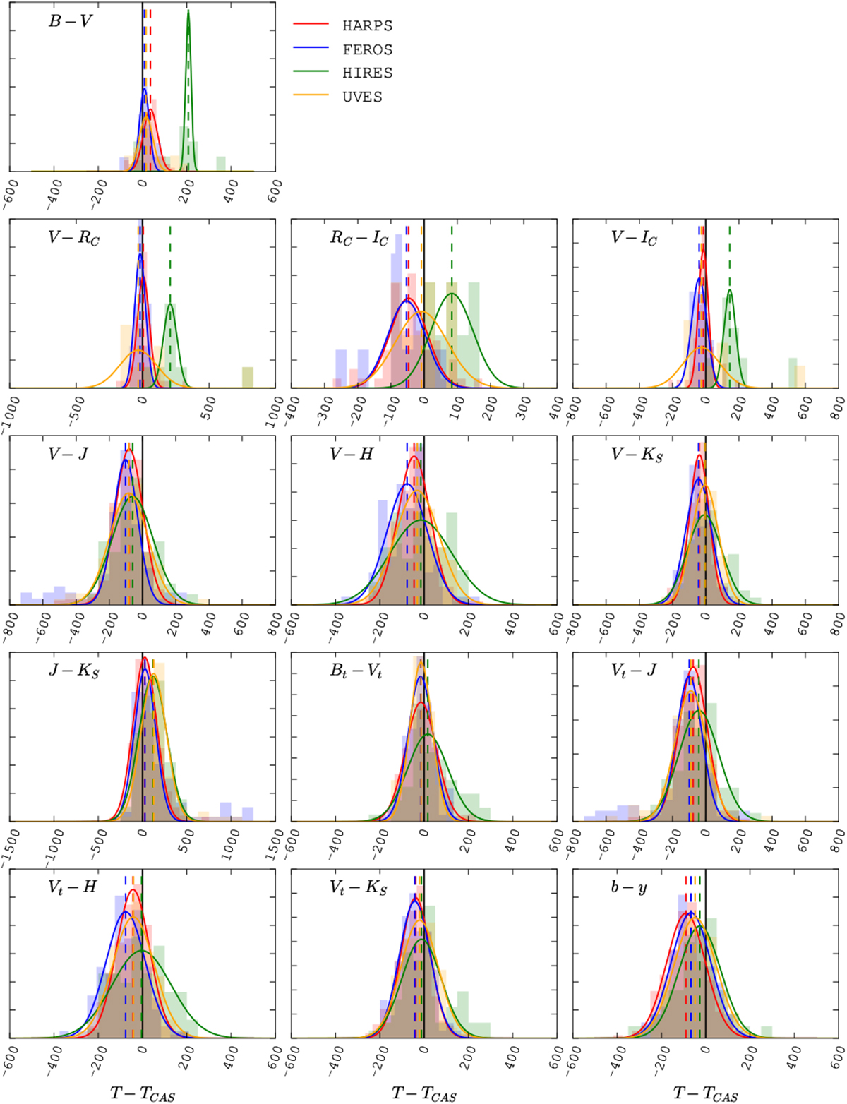
Fig. 13
Histograms of the difference between the temperature computed by SPECIES, and those using the colour relations from C10. The lines correspond to Gaussian distributions adjusted to the histograms, with mean values listed in Table 4. Each colour represents a different instrument: red for HARPS, blue for FEROS, green for HIRES, and orange for UVES. The different panels show the temperatures computed using different photometric colours, mentioned in Sect. 2.
Current usage metrics show cumulative count of Article Views (full-text article views including HTML views, PDF and ePub downloads, according to the available data) and Abstracts Views on Vision4Press platform.
Data correspond to usage on the plateform after 2015. The current usage metrics is available 48-96 hours after online publication and is updated daily on week days.
Initial download of the metrics may take a while.