Fig. 4
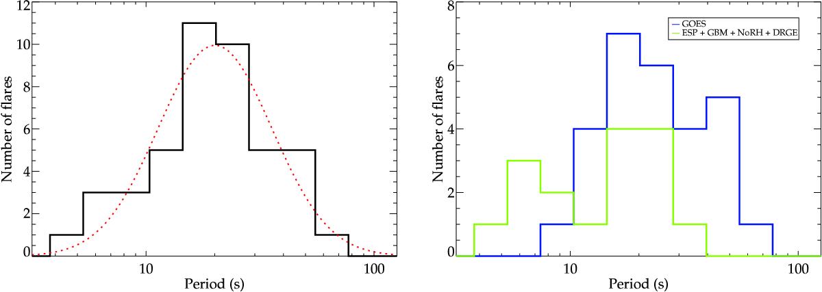
Histograms of the QPP periods. Left: the black solid line shows all QPP periods combined and the dotted red line shows a Gaussian fit to the overall distribution, which corresponds to an average QPP period of ![]() s for the set of flares examined. Right: the same histogram but with the QPP periods separated based on which instrument was used. The blue line shows the QPP periods detected in the GOES/XRS wavebands with a 2 s cadence, and the green line shows those detected by EVE/ESP, Fermi/GBM, NoRH, and Vernov/DRGE with a 1 s cadence. The distribution for GOES/XRS appears to be shifted slightly towards longer periods than the other instruments.
s for the set of flares examined. Right: the same histogram but with the QPP periods separated based on which instrument was used. The blue line shows the QPP periods detected in the GOES/XRS wavebands with a 2 s cadence, and the green line shows those detected by EVE/ESP, Fermi/GBM, NoRH, and Vernov/DRGE with a 1 s cadence. The distribution for GOES/XRS appears to be shifted slightly towards longer periods than the other instruments.
Current usage metrics show cumulative count of Article Views (full-text article views including HTML views, PDF and ePub downloads, according to the available data) and Abstracts Views on Vision4Press platform.
Data correspond to usage on the plateform after 2015. The current usage metrics is available 48-96 hours after online publication and is updated daily on week days.
Initial download of the metrics may take a while.