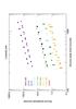
Fig. 5
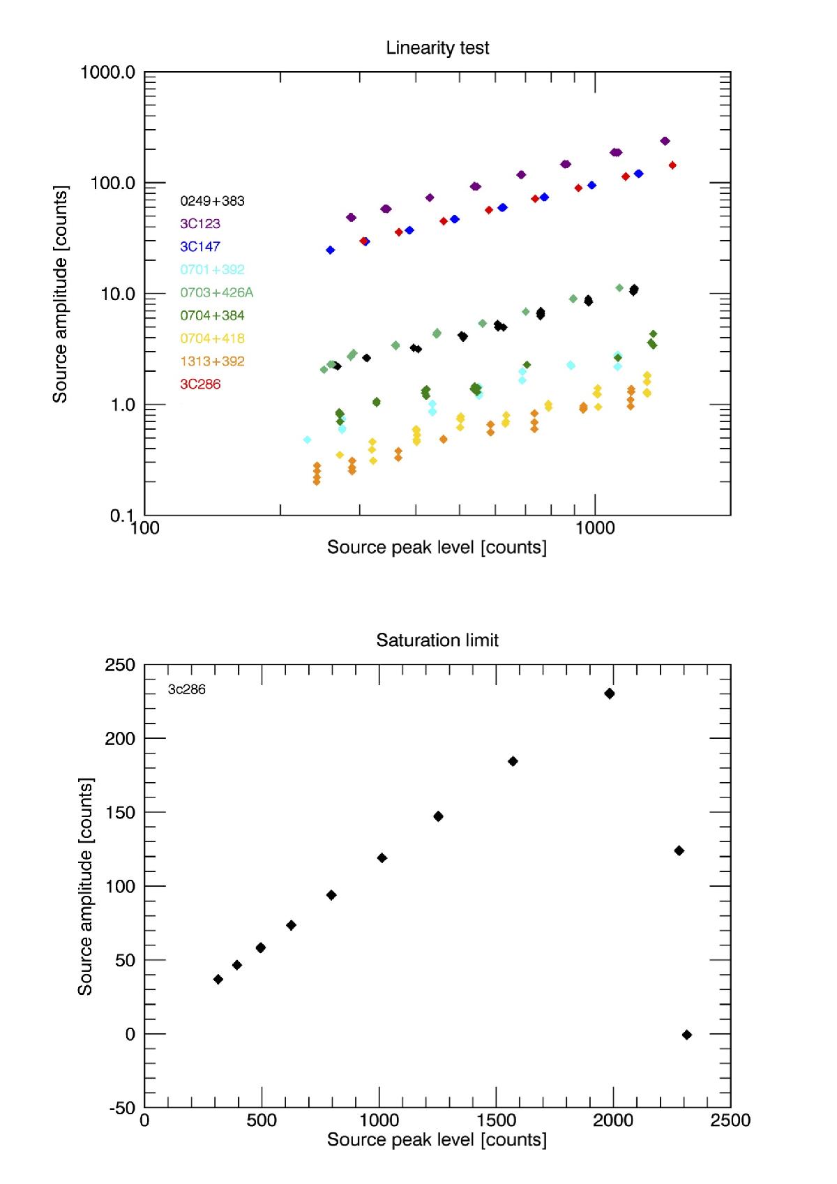
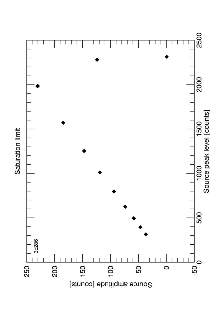
Source (baseline-subtracted) amplitude vs. peak (source + baseline) level, both expressed in raw counts. Increasing raw counts on both axes reflect decreasing attenuation. Top panel: illustration of the test performed with 250 MHz bandwidth at a central observing frequency of 7.25 GHz. Different sources are indicated by different colors, as labeled in the panel. Bottom panel: illustration of the test performed with 1200 MHz bandwidth at a central observing frequency of 6.8 GHz. Here only the bright source 3C 286 (5.87 Jy at 6.8 GHz, Perley & Butler 2013) is shown, to highlight the levels of raw counts where saturation is reached.
Current usage metrics show cumulative count of Article Views (full-text article views including HTML views, PDF and ePub downloads, according to the available data) and Abstracts Views on Vision4Press platform.
Data correspond to usage on the plateform after 2015. The current usage metrics is available 48-96 hours after online publication and is updated daily on week days.
Initial download of the metrics may take a while.