Fig. 5
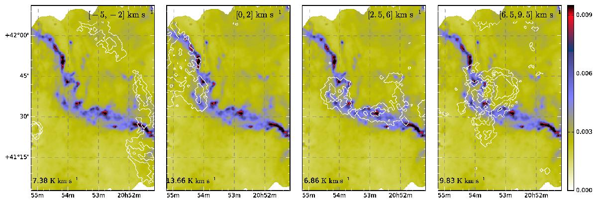
Different velocity structures identified from the Osaka observations. The underlying colour map is the τ250 map. The contours have been computed from the Osaka 12CO data and show 50%, 70%, and 90% of the peak emission in the velocity interval noted in the upper right corner. The peak emission in each velocity interval is denoted in the lower left corner.
Current usage metrics show cumulative count of Article Views (full-text article views including HTML views, PDF and ePub downloads, according to the available data) and Abstracts Views on Vision4Press platform.
Data correspond to usage on the plateform after 2015. The current usage metrics is available 48-96 hours after online publication and is updated daily on week days.
Initial download of the metrics may take a while.