Fig. 2
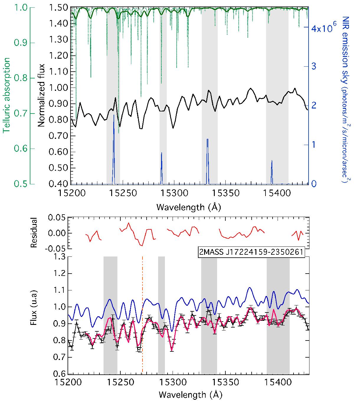
Top: individual spectrum (black) for the circled target in Fig. 1 and the green data point in Fig. 4. The green lines show the telluric model before and after convolution. Gray rectangles indicate masks at strong sky emission lines (blue). Bottom: example of fit is shown. The blue curve is the convolved stellar model. The magenta curve is the fitted stellar+telluric model. The dashed orange line shows the DIB position.
Current usage metrics show cumulative count of Article Views (full-text article views including HTML views, PDF and ePub downloads, according to the available data) and Abstracts Views on Vision4Press platform.
Data correspond to usage on the plateform after 2015. The current usage metrics is available 48-96 hours after online publication and is updated daily on week days.
Initial download of the metrics may take a while.