Fig. 1
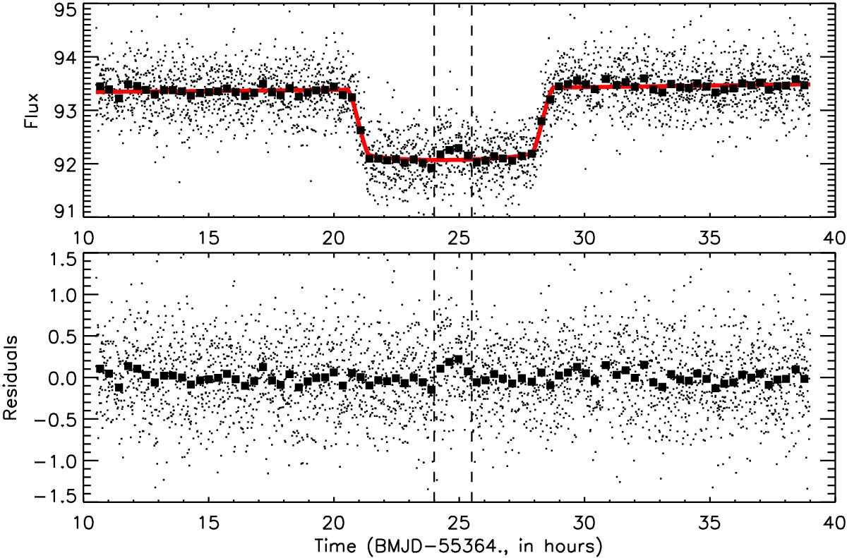
Light curve of CoRoT-9 during the transit of CoRoT-9b on June 18, 2010. Each dot represents an individual photometric measurement. Large squares show the data measurements rebinned by 40. The thick red line shows the best fit with an exoplanet transit model. The bottom panel gives the residual of the measurements after subtraction of the best fit model. The two vertical dashed lines represent the time range of the estimated time of the photometric bump that could be due to the transit in front of a stellar spot. The data taken within this time range have been excluded from the analysis.
Current usage metrics show cumulative count of Article Views (full-text article views including HTML views, PDF and ePub downloads, according to the available data) and Abstracts Views on Vision4Press platform.
Data correspond to usage on the plateform after 2015. The current usage metrics is available 48-96 hours after online publication and is updated daily on week days.
Initial download of the metrics may take a while.