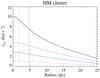
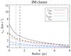
Fig. 3

Distribution of relative velocities in our encounter model for the stellar cluster. The five curves in the left panel represent, from top to bottom, the maximum allowed relative velocity (solid, black), its 90th percentile (dotted, red), mean (solid, blue) and 10th percentile values (dotted, black). Shown as vertical (black) lines are the core (dotted) and half-mass (dashed) radii. Left panel: relative velocity distributions for the high-mass cluster. Right panel: relative velocity distributions for the intermediate-mass cluster at two time steps. The first step represents the time interval 100–125 Myr. The second time step represents the time interval 300–325 Myr, and is shown only by a thick dashed black line representing the maximum relative velocity, a thick dashed blue line representing the mean, and a vertical thick dashed line representing the half-mass radius at this time. The core radius is not shown at this time, but is available for all time steps in Table A.1.
Current usage metrics show cumulative count of Article Views (full-text article views including HTML views, PDF and ePub downloads, according to the available data) and Abstracts Views on Vision4Press platform.
Data correspond to usage on the plateform after 2015. The current usage metrics is available 48-96 hours after online publication and is updated daily on week days.
Initial download of the metrics may take a while.