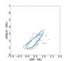
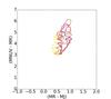
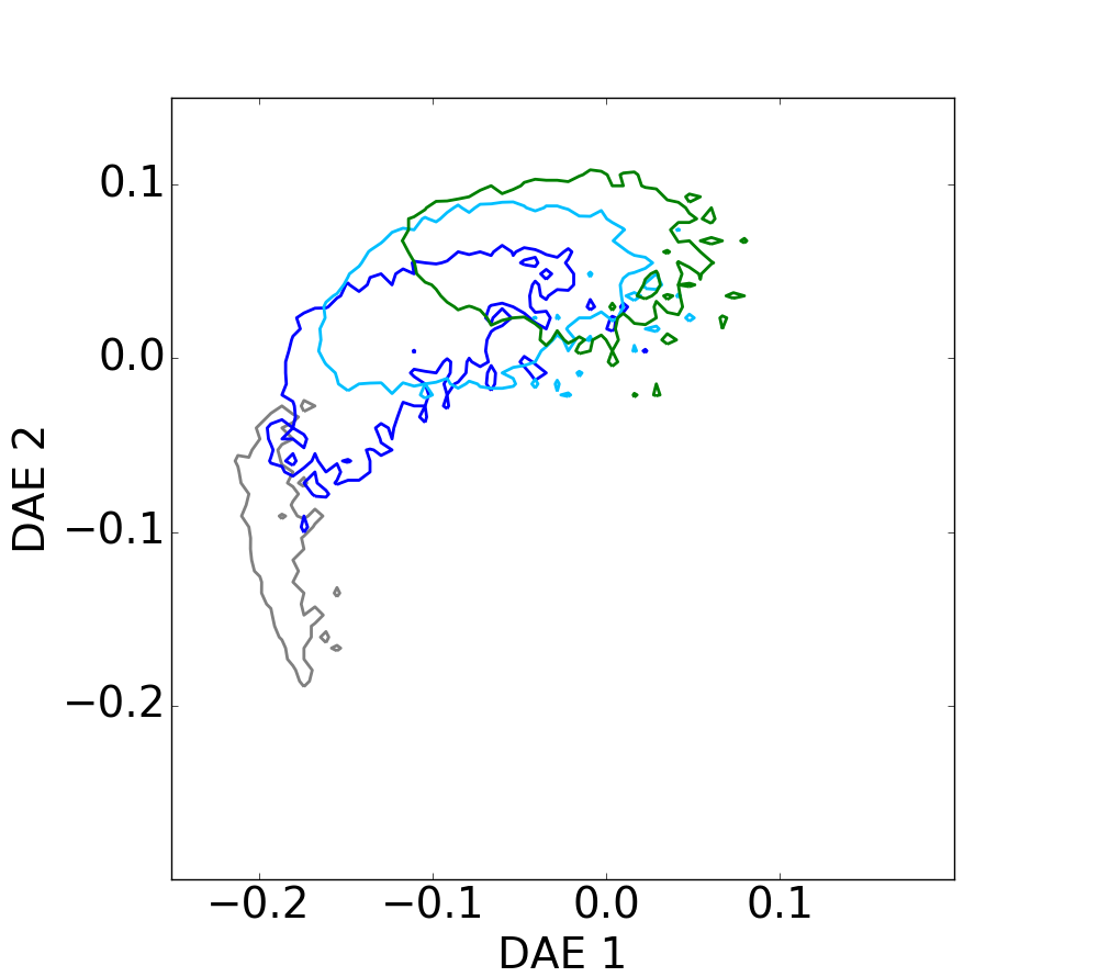
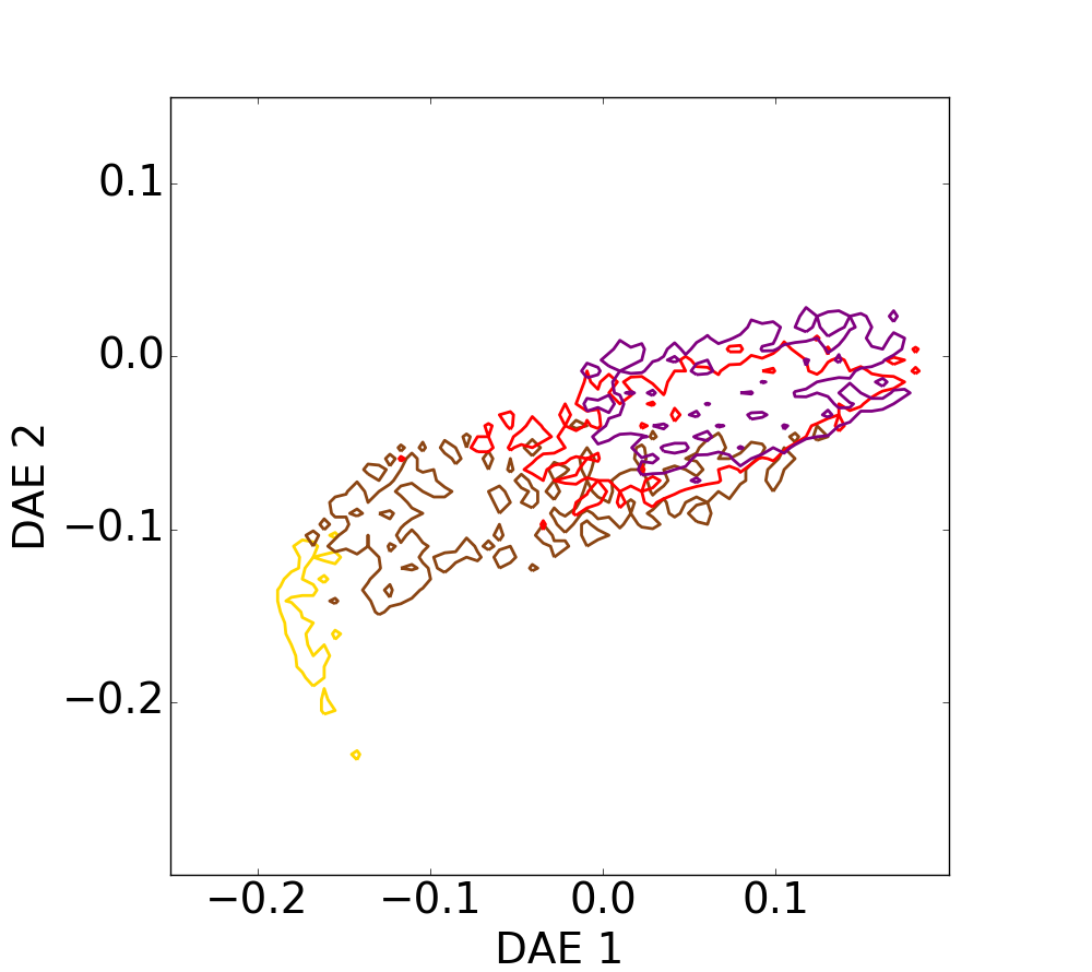
Fig. 7
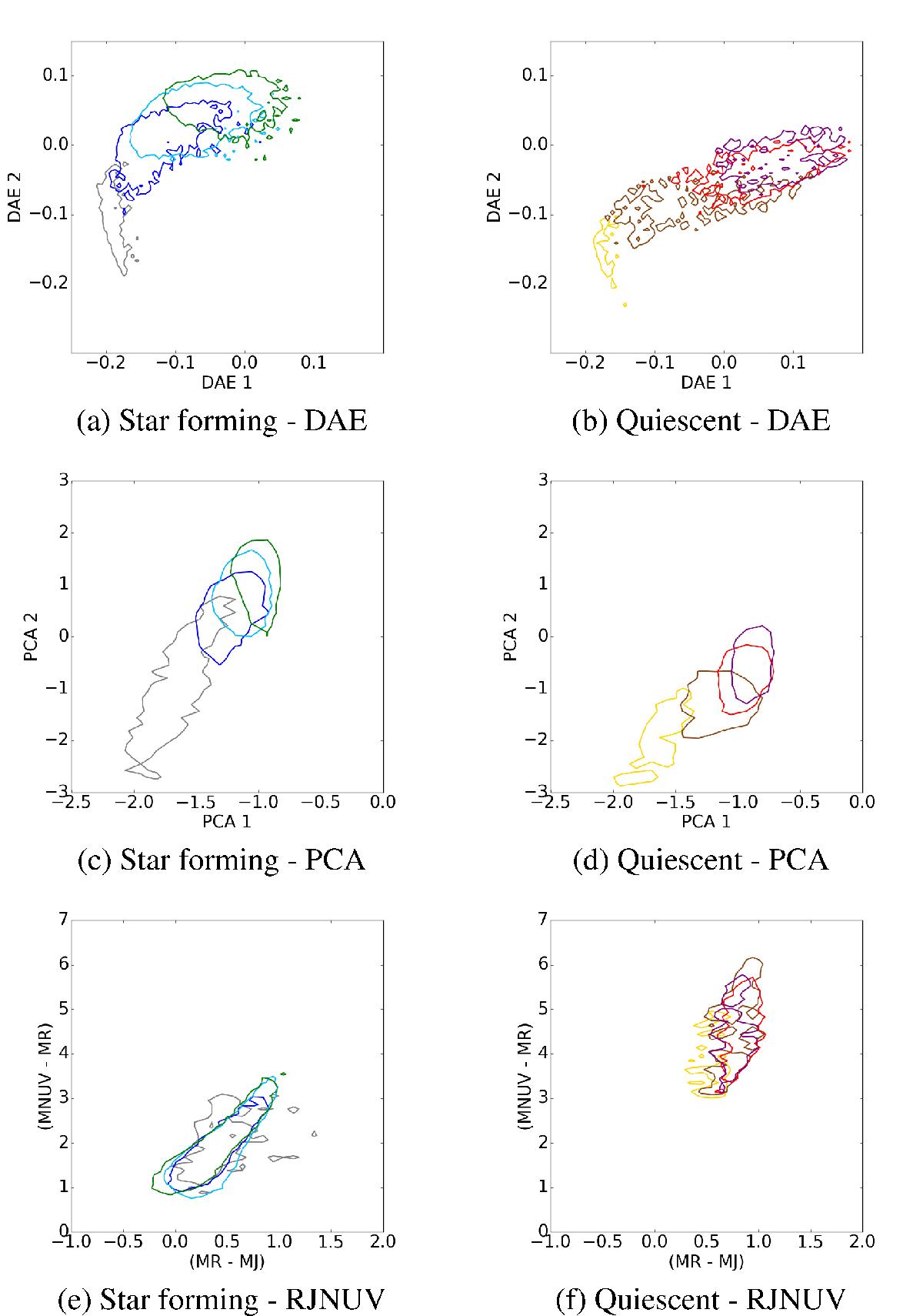
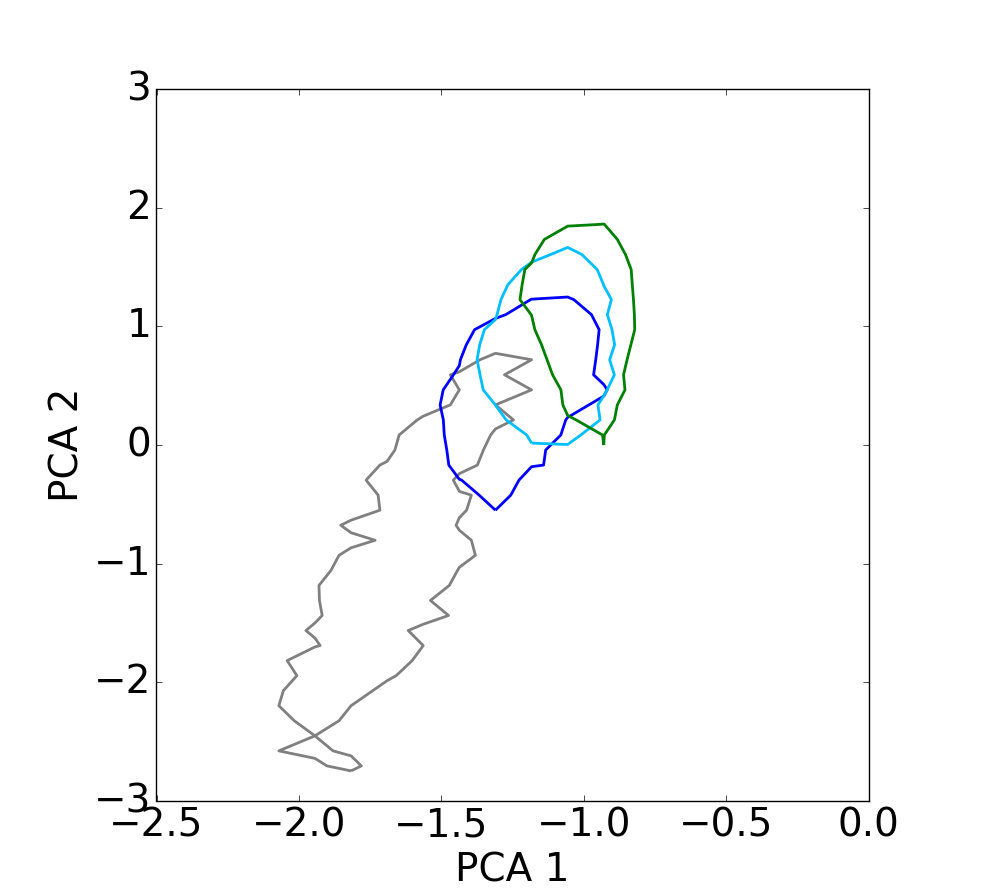
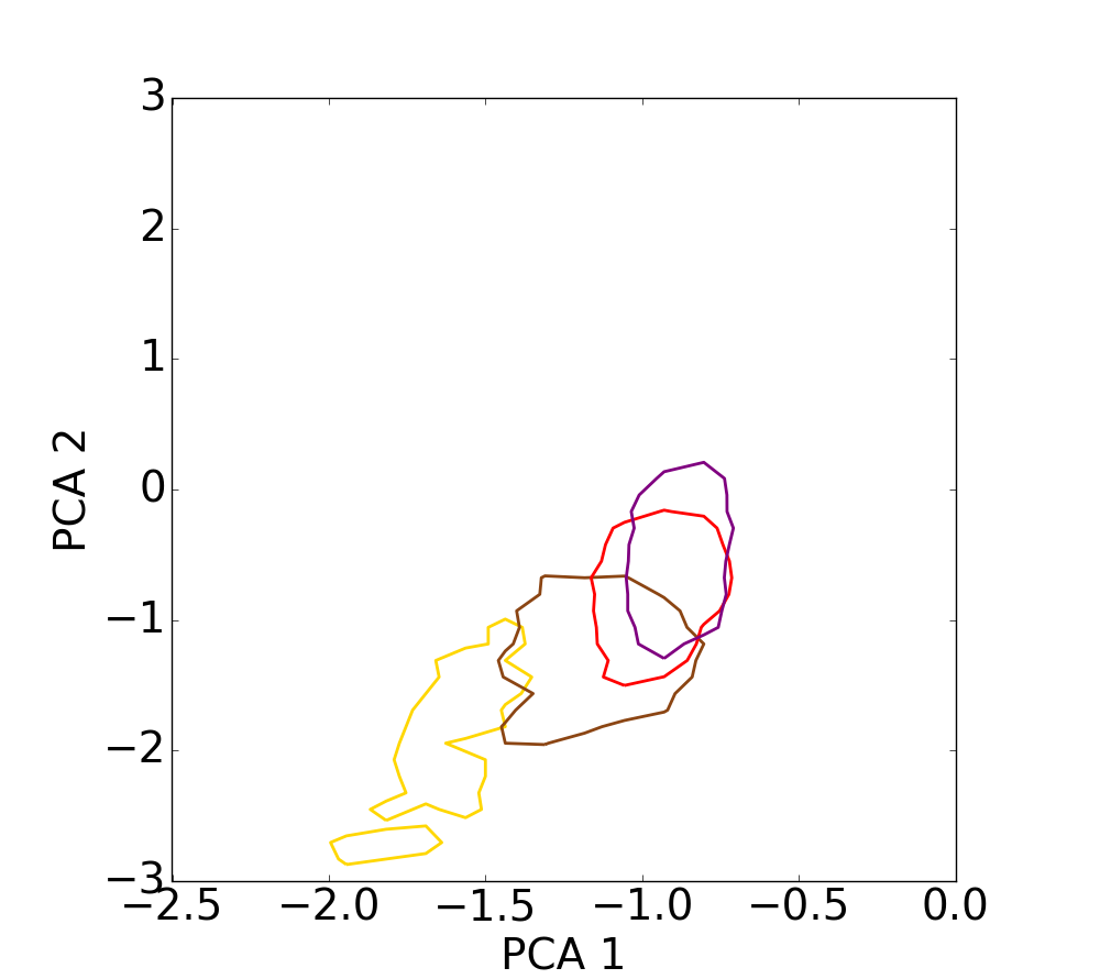
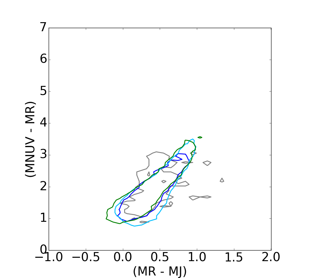
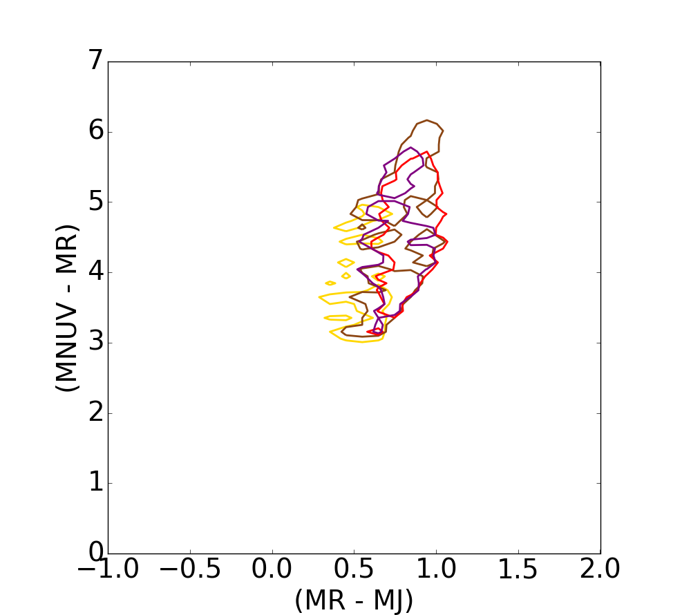
Contour plots for the four redshift bins displayed in Figs. 4−6 for the DAE diagram, the PCA diagram and the the RJ − NUVR diagram, respectively. The contour plots are displayed at 75% of the samples in the corresponding histogram for the different redshift bins. The contour’s colors grow from grey to green for star-forming galaxies, and from yellow to purple for quiescent galaxies respectively. Accordingly, top figures illustrate the evolution of the galaxies with the redshift for the DAE diagram, and bottom figures evidence the overlap in the RJ − NUVR plane. Results obtained with the PCA, at the center, are slightly worse than those exhibited by the DAE diagram, in the sense that the overlap is smaller with the DAE diagram. And PCA performs slightly better than the RJ − NUVR diagram since no redshift variation is observed in the latter.

Current usage metrics show cumulative count of Article Views (full-text article views including HTML views, PDF and ePub downloads, according to the available data) and Abstracts Views on Vision4Press platform.
Data correspond to usage on the plateform after 2015. The current usage metrics is available 48-96 hours after online publication and is updated daily on week days.
Initial download of the metrics may take a while.