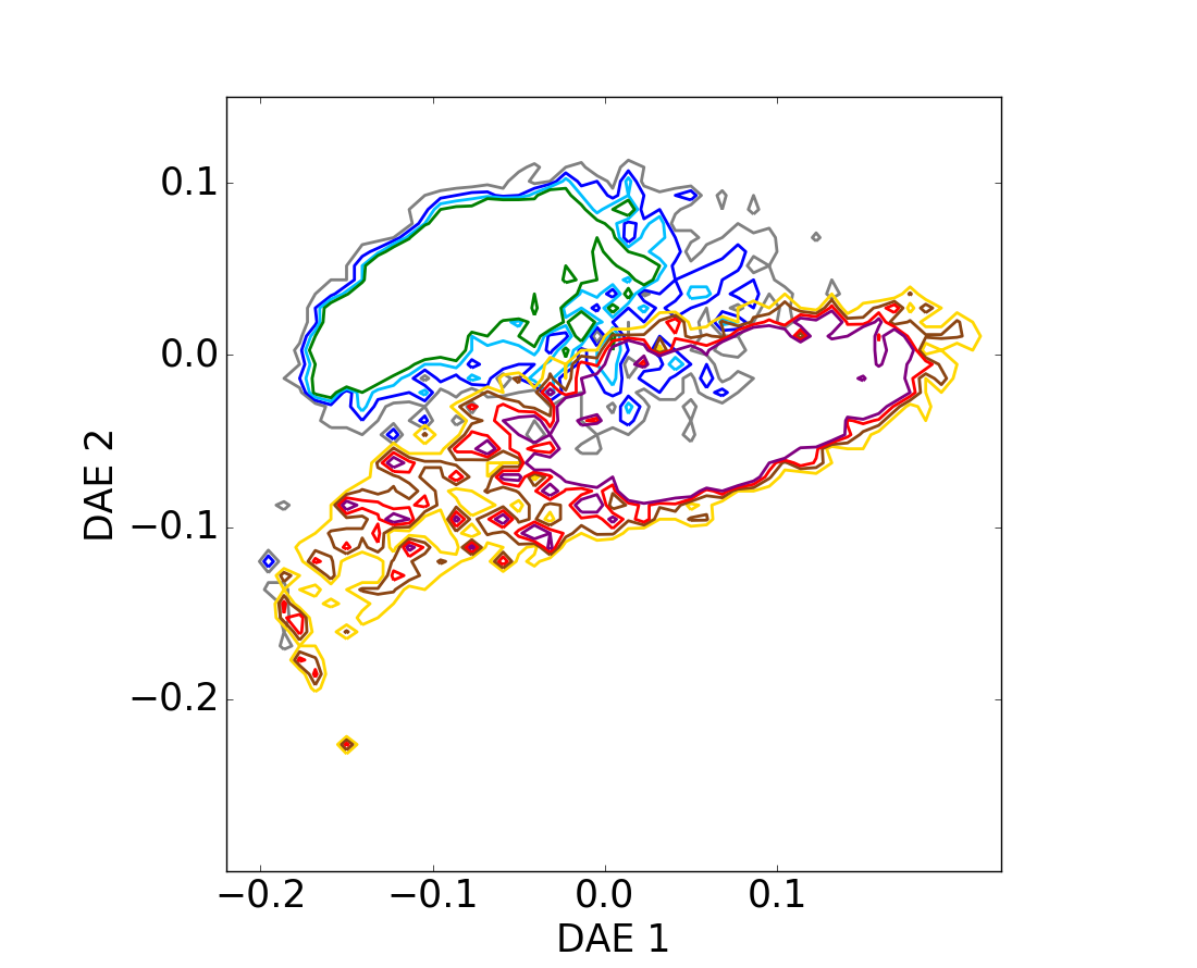
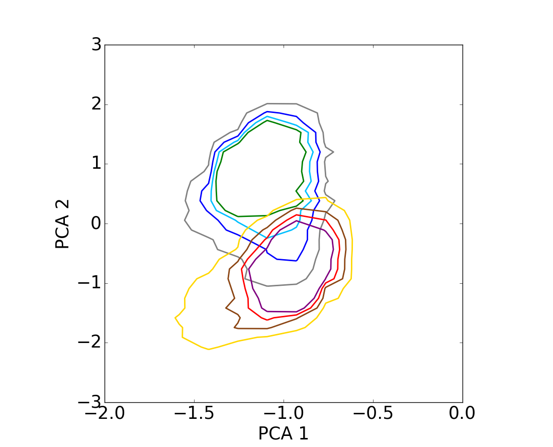
Fig. 3
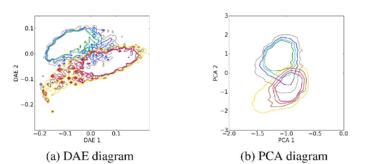
Contour levels for the test set on the DAE diagram a) and on the PCA diagram b). The curves are depicted from 95% of the population in grey to 70% in green for star-forming galaxies, and from yellow to purple for quiescent sources. These figures illustrate that the separation between the two classes of populations is clearer on the DAE diagram compared to the PCA diagram.
Current usage metrics show cumulative count of Article Views (full-text article views including HTML views, PDF and ePub downloads, according to the available data) and Abstracts Views on Vision4Press platform.
Data correspond to usage on the plateform after 2015. The current usage metrics is available 48-96 hours after online publication and is updated daily on week days.
Initial download of the metrics may take a while.