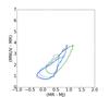
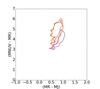
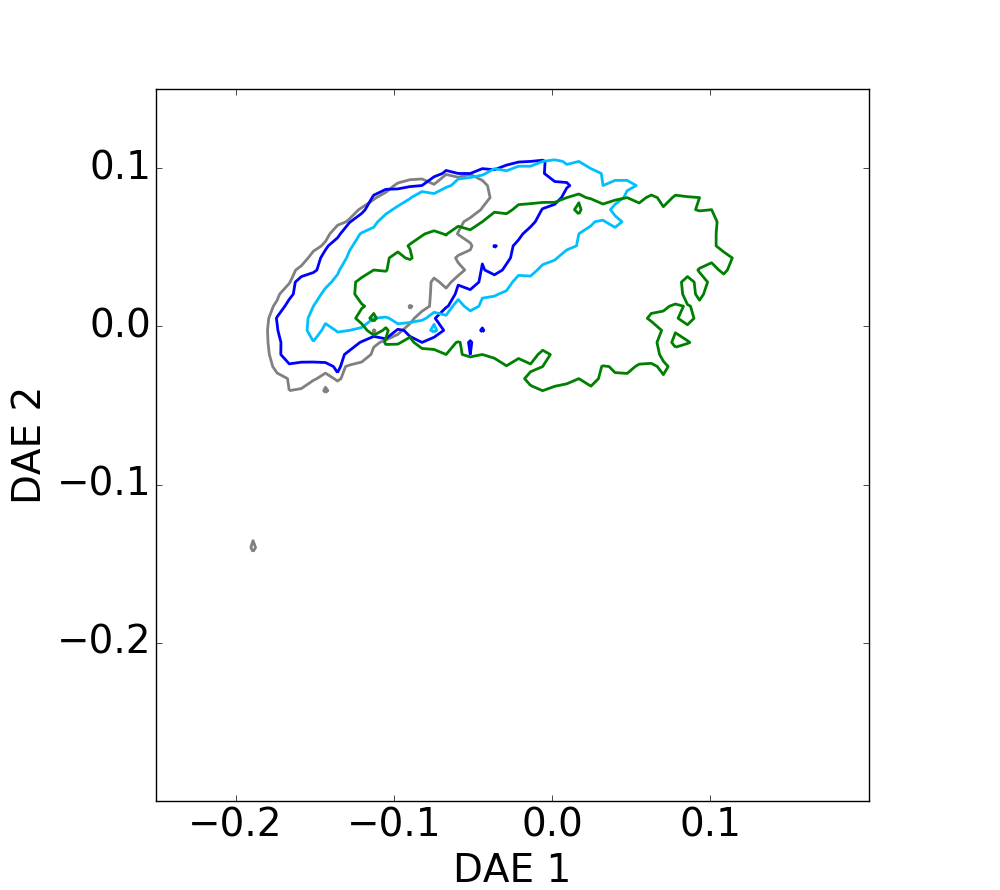
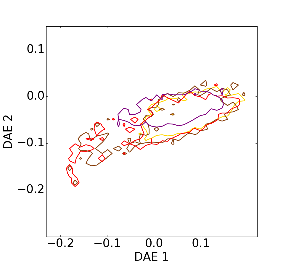
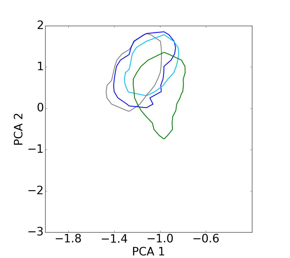
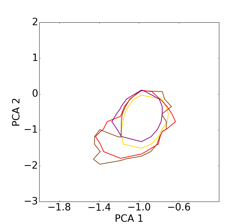
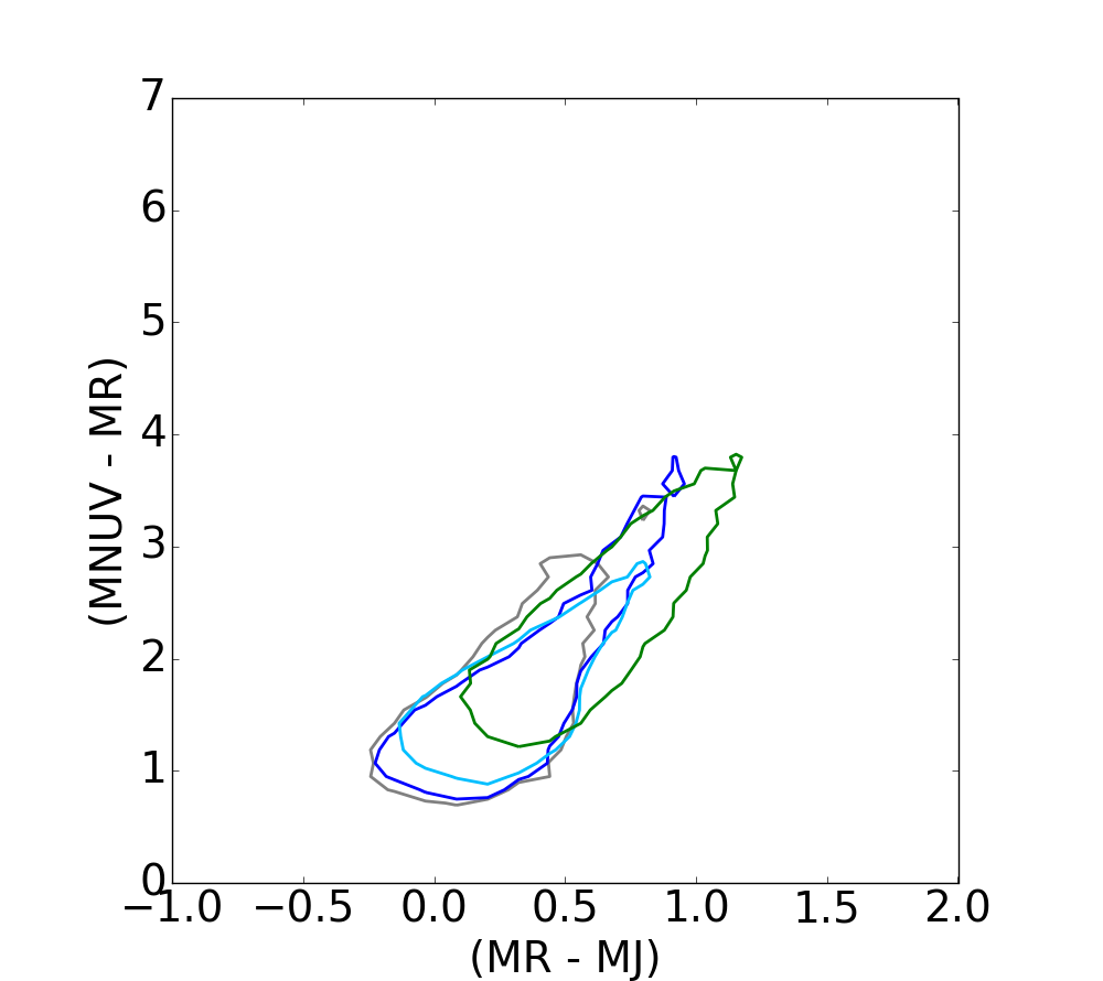
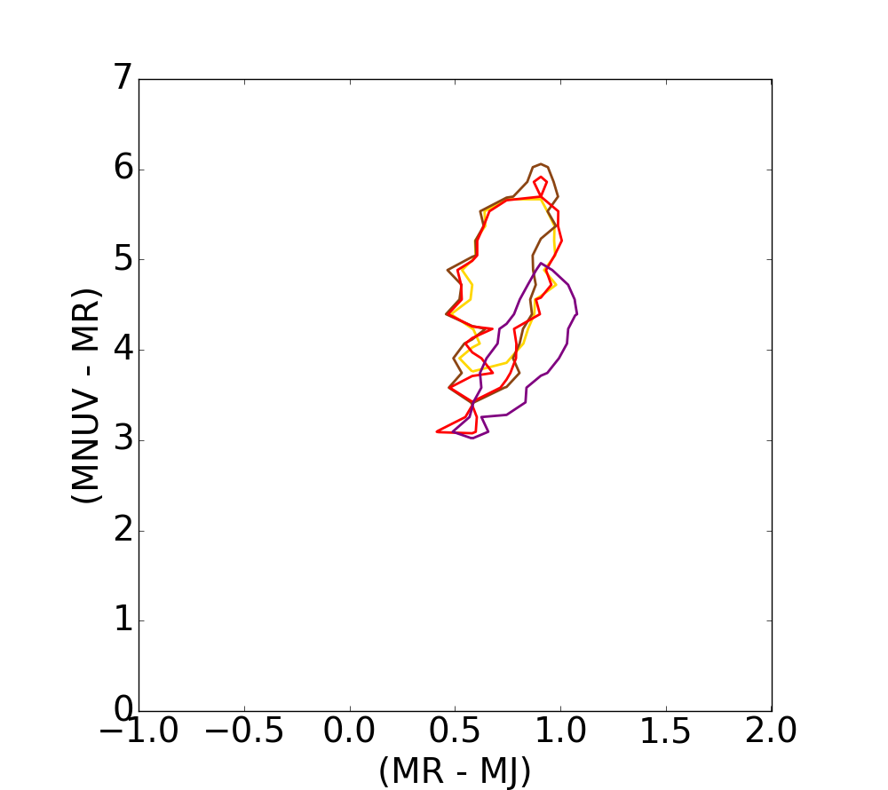
Fig. 14
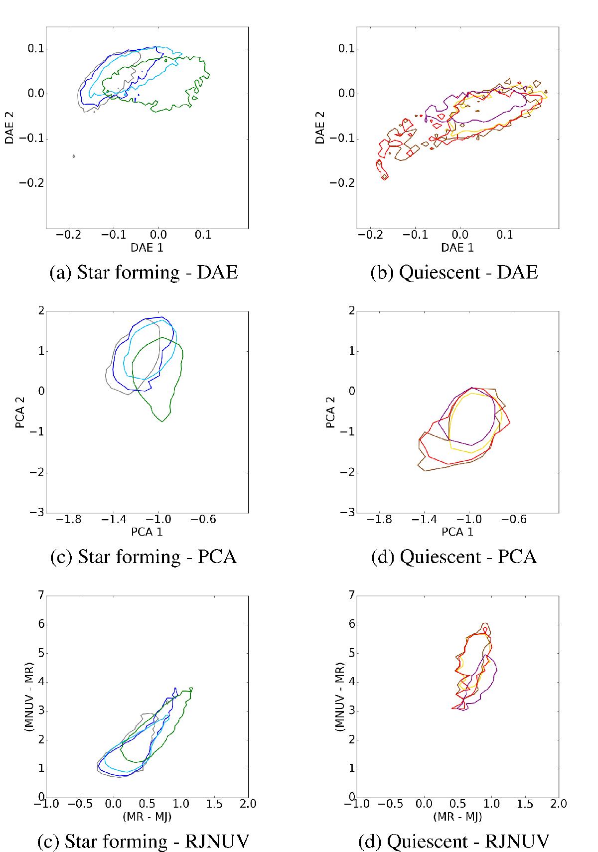
Contour plots for different extinction bins on the DAE diagram, on the PCA projection and on the RJ – NUVR plane. This figure illustrates the distribution of the extinction range evolution. The values have been split over four bins and displayed from grey to green for star-forming populations, and from yellow to purple for quiescent galaxies. The contour plots are depicted at 75% of the samples at each bin for the DAE and the RJ – NUVR diagrams.

Current usage metrics show cumulative count of Article Views (full-text article views including HTML views, PDF and ePub downloads, according to the available data) and Abstracts Views on Vision4Press platform.
Data correspond to usage on the plateform after 2015. The current usage metrics is available 48-96 hours after online publication and is updated daily on week days.
Initial download of the metrics may take a while.