Fig. 7
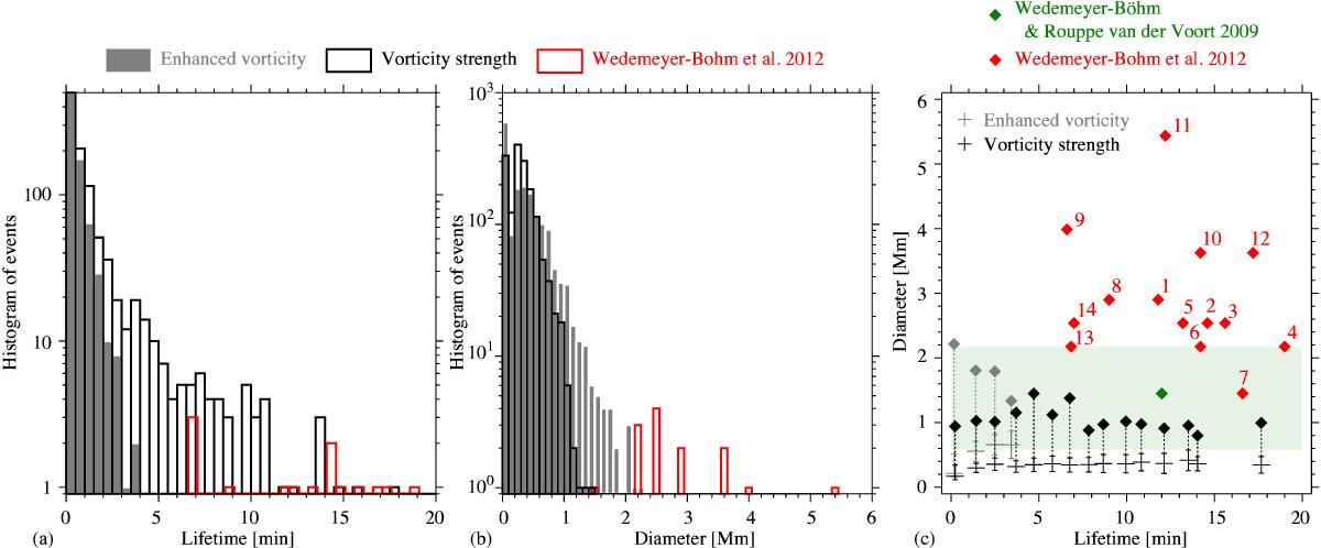
Histograms of a) the lifetime of the detected events and b) the maximum diameter of the detected events. In panel c), the lifetime is plotted versus vortex diameter. In panels a) and b), the results found with the enhanced vorticity method are plotted with grey bars, whereas results of the vorticity strength method are shown as black lines. For comparison, the chromospheric swirls found by Wedemeyer-Böhm et al. (2012) are plotted with red lines. In panel c, all events detected in the simulation are grouped according to their lifetime in bins of 1 min. For each group, the average value is plotted as a horizontal line ± one standard deviation, indicated by the shorter horizontal line above and below. The maximum values are plotted as diamonds. Again, the results of the enhanced vorticity method are plotted in grey, whereas the results of the vorticity strength method are shown in black. For comparison, the chromospheric swirls observed by Wedemeyer-Böhm et al. (2012) are plotted as red diamonds with numbers according to the table in the supplementary information of their study. In addition, the clearest swirl described by Wedemeyer-Böhm & Rouppe van der Voort (2009) is represented as a green diamond, whereas the range of swirl diameters found in that study is marked as a green shaded area.
Current usage metrics show cumulative count of Article Views (full-text article views including HTML views, PDF and ePub downloads, according to the available data) and Abstracts Views on Vision4Press platform.
Data correspond to usage on the plateform after 2015. The current usage metrics is available 48-96 hours after online publication and is updated daily on week days.
Initial download of the metrics may take a while.