Fig. 8
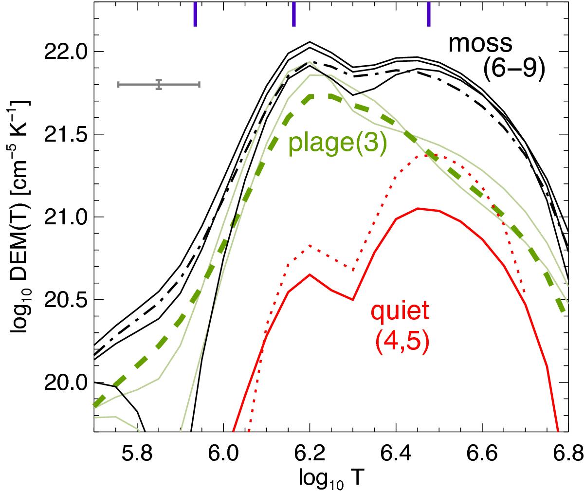
Differential emission measure (DEM) distribution for different structures. The labelling of the lines corresponds to the regions marked in Figs. 2β,γ. The green lines represent two individual small loop-like features (thin green; 1, 2) and an average covering the whole plage area hosting the small loop features (thick dashed green; 3). For comparison the red lines are the inversions for the quiet regions (4, 5). The black lines show the DEM in the moss areas (6–8), with the thick dashed line for the average over the larger moss region (9). The error bars (grey) present the average uncertainties for all curves in log T range from 6.0 to 6.7. The three blue markers at the top axis indicate the temperature of the peaks of the DEM components in coronal holes, quiet Sun, and active region according to Landi & Feldman (2008). See Sect. 5.1.
Current usage metrics show cumulative count of Article Views (full-text article views including HTML views, PDF and ePub downloads, according to the available data) and Abstracts Views on Vision4Press platform.
Data correspond to usage on the plateform after 2015. The current usage metrics is available 48-96 hours after online publication and is updated daily on week days.
Initial download of the metrics may take a while.