Fig. 9
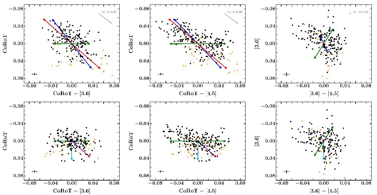
Colour–magnitude diagrams. Top row, left to right: raw light curve data (black points) in the CoRoT vs. CoRoT–[3.6], CoRoT vs. CoRoT–[4.5] and [3.6] vs. [3.6]–[4.5] spaces. Data masked in the spot modelling are shown by the orange triangles. Coloured arrows show the effects of different types of variability: cold spots (blue), hot spots (red) and dust emission (green). Grey arrows indicate the direction of interstellar dust extinction. Bottom row, left to right: same as for the top row but showing the residuals of the spot modelling. Magenta and cyan arrows indicate the effects of obscuration by small and large dust grains, respectively. The error bar in the bottom left corner of each subplot shows a representative uncertainty for each data point. All plots share common axes.
Current usage metrics show cumulative count of Article Views (full-text article views including HTML views, PDF and ePub downloads, according to the available data) and Abstracts Views on Vision4Press platform.
Data correspond to usage on the plateform after 2015. The current usage metrics is available 48-96 hours after online publication and is updated daily on week days.
Initial download of the metrics may take a while.