Fig. 8
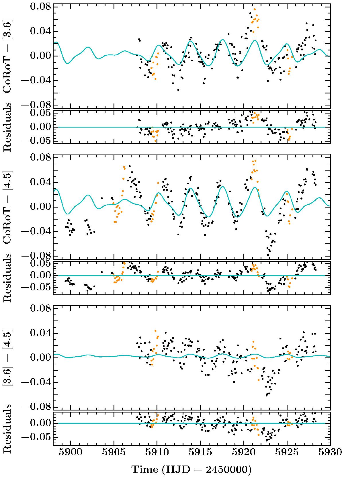
CoRoT and Spitzer colour vs. time relations. Top to bottom: CoRoT–[3.6], CoRoT–[4.5] and [3.6]–[4.5], with residuals immediately below in each case. Black points show data used in the spot modelling, orange points indicate data that was masked in the fit and the cyan line represents the colour signature of the spot model. All colour-time relations display quasi-sinusoidal variations, which can most clearly be seen comparing the widely separated bandpasses of the CoRoT–[4.5] colour space. All plots share common axes.
Current usage metrics show cumulative count of Article Views (full-text article views including HTML views, PDF and ePub downloads, according to the available data) and Abstracts Views on Vision4Press platform.
Data correspond to usage on the plateform after 2015. The current usage metrics is available 48-96 hours after online publication and is updated daily on week days.
Initial download of the metrics may take a while.