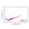
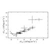
Fig. 7
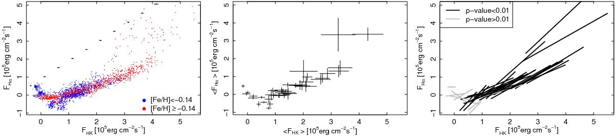
Left panel: close-up view of the FHK vs. FHα diagram. Colors code the metallicity of the stars as shown in the legend. Black crosses represent the typical measurement uncertainties at different activity levels. Middle panel: same as in the left panel for the median of the flux measurements. For each star, the error bars represent the MAD of the measurements shown in the left panel. Right panel: the same as in the left panel, representing each star with the corresponding linear fit to its flux-flux values. Gray lines mark best fits with low statistical significance, while black lines represent p-values lower than 1% based on Spearman’s correlation test.
Current usage metrics show cumulative count of Article Views (full-text article views including HTML views, PDF and ePub downloads, according to the available data) and Abstracts Views on Vision4Press platform.
Data correspond to usage on the plateform after 2015. The current usage metrics is available 48-96 hours after online publication and is updated daily on week days.
Initial download of the metrics may take a while.