Fig. 4
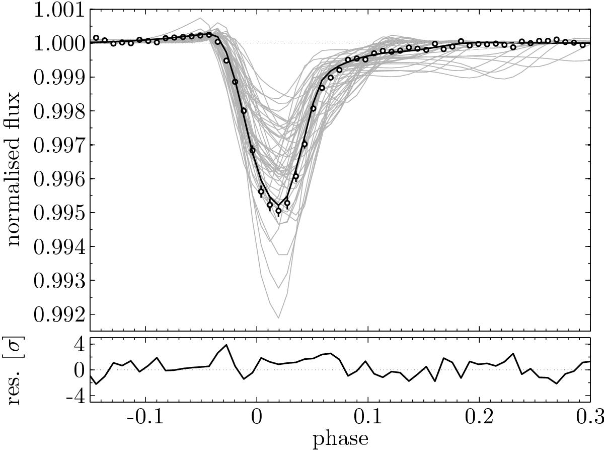
Top: comparison between the best-fit model (black line) and the Kepler data (black circles with error bars). To show the range of variation within the Markov chain, 50 randomly selected samples from the chain are underplotted as grey lines. Bottom: residuals of the best-fit model, normalised using the phase-dependent error bars on the data.
Current usage metrics show cumulative count of Article Views (full-text article views including HTML views, PDF and ePub downloads, according to the available data) and Abstracts Views on Vision4Press platform.
Data correspond to usage on the plateform after 2015. The current usage metrics is available 48-96 hours after online publication and is updated daily on week days.
Initial download of the metrics may take a while.