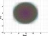
Fig. 3
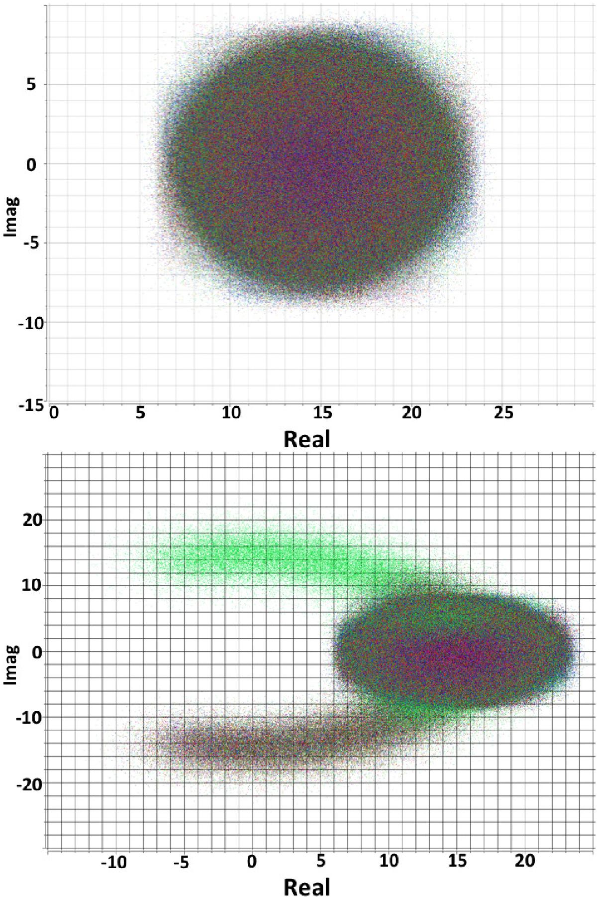
Example of diagnostic plots during the calibration process (taken from Bihr 2016). The imaginary part of the visibility is plotted as a function of the real part for the calibrator 3C 286 in the HI line. The color-coding corresponds to the different antennas. For a point source like the calibrators a roundish cloud as shown in the top panel is expected. The deviations in the bottom panel isolate bad antennas that need to be flagged.
Current usage metrics show cumulative count of Article Views (full-text article views including HTML views, PDF and ePub downloads, according to the available data) and Abstracts Views on Vision4Press platform.
Data correspond to usage on the plateform after 2015. The current usage metrics is available 48-96 hours after online publication and is updated daily on week days.
Initial download of the metrics may take a while.