Fig. 7
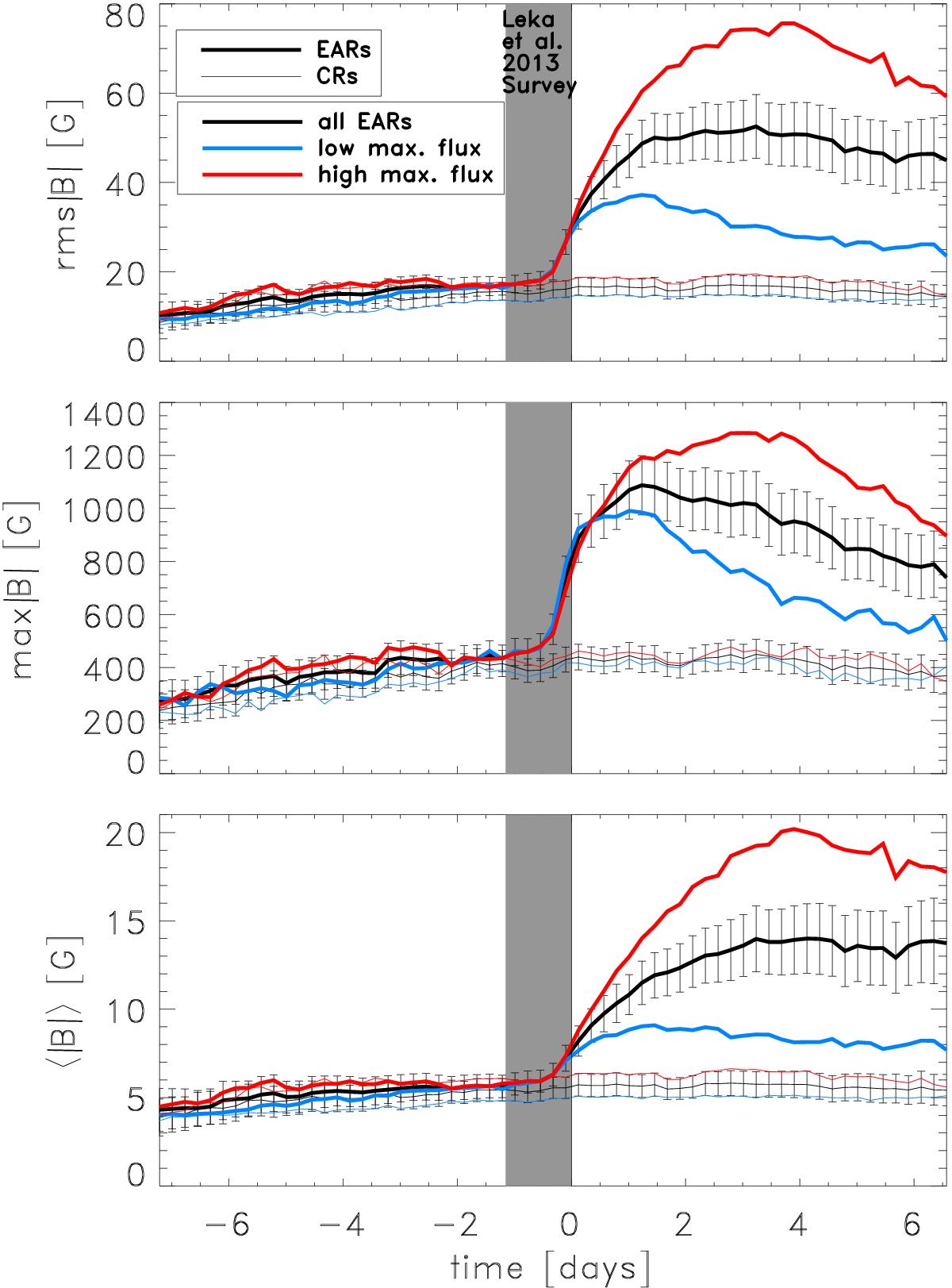
Mean (bottom panel), maximum (middle panel), and rms (top panel) of the absolute line-of-sight magnetic field in the central 10° radius averaged over all emerging active regions (thick black) at each time interval. The blue curve shows the values for only those active regions that reach a maximum flux that is lower than the median maximum flux value, and the red curve shows the values for the emerging active regions that reach a higher value. The corresponding values for the control regions are shown by the thin curves. The shaded grey area indicates the time span covered by the previous LBB survey. The uncertainties are the rms of the quantity. For example, in the top panel, ![]() , where N is the number of active regions at time interval, TI.
, where N is the number of active regions at time interval, TI.
Current usage metrics show cumulative count of Article Views (full-text article views including HTML views, PDF and ePub downloads, according to the available data) and Abstracts Views on Vision4Press platform.
Data correspond to usage on the plateform after 2015. The current usage metrics is available 48-96 hours after online publication and is updated daily on week days.
Initial download of the metrics may take a while.