Fig. 20
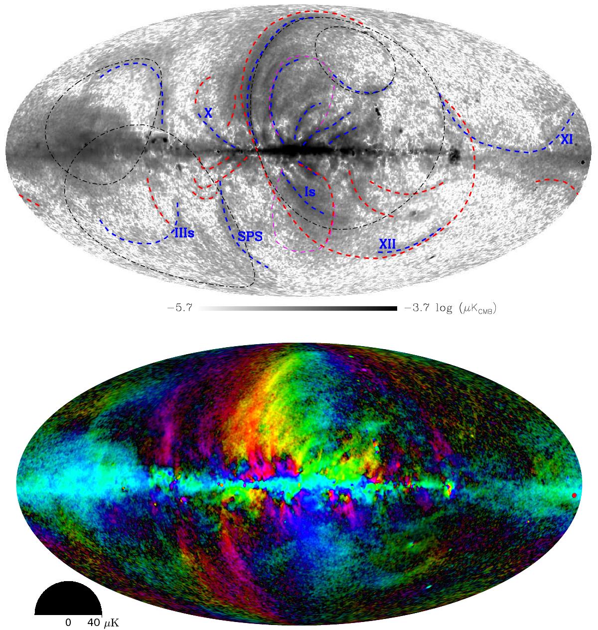
Top: combined weighted polarization intensity map after debiasing, with features highlighted. The black dash-dot lines show the outlines of Loops I to IV, as defined by Berkhuijsen et al. (1971), the blue dashed lines show the filaments described by Vidal et al. (2015) using WMAP polarization data, the red dashed lines show features that are visible in the new Planck data, and the magenta dashed lines show the outline of the Fermi bubbles. Filaments that are discussed in the text are labelled. Bottom: the same combined polarization intensity map, with projected magnetic field angle (at 90° to the polarization angle) encoded in colour with asinh scaling. The coloured half-disc represents the polarization angle depicted in the map, with 0deg horizontal, while the polarization intensity is represented with the radial distance along the half-disc.
Current usage metrics show cumulative count of Article Views (full-text article views including HTML views, PDF and ePub downloads, according to the available data) and Abstracts Views on Vision4Press platform.
Data correspond to usage on the plateform after 2015. The current usage metrics is available 48-96 hours after online publication and is updated daily on week days.
Initial download of the metrics may take a while.