Fig. 1
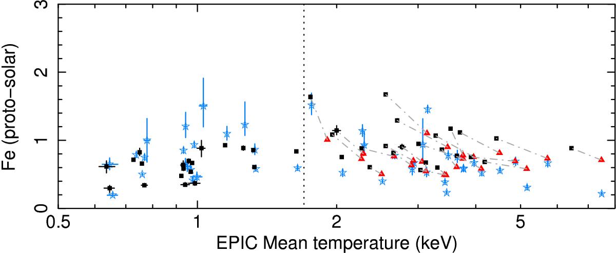
Mean temperature (EPIC) versus absolute Fe abundance for the full sample. The black squares and the red triangles show the EPIC measurements within 0.05r500 and 0.2r500, respectively. Each pair of measurements (0.05r500,0.2r500) that belong to the same hot cluster is connected by a grey dash-dotted line. The blue stars show the RGS measurements (adapted from de Plaa et al. 2016), scaled on their respective EPIC mean temperature within 0.2r500. The vertical black dotted line separates the cool groups/ellipticals from the hot clusters (see text).
Current usage metrics show cumulative count of Article Views (full-text article views including HTML views, PDF and ePub downloads, according to the available data) and Abstracts Views on Vision4Press platform.
Data correspond to usage on the plateform after 2015. The current usage metrics is available 48-96 hours after online publication and is updated daily on week days.
Initial download of the metrics may take a while.