Fig. 10
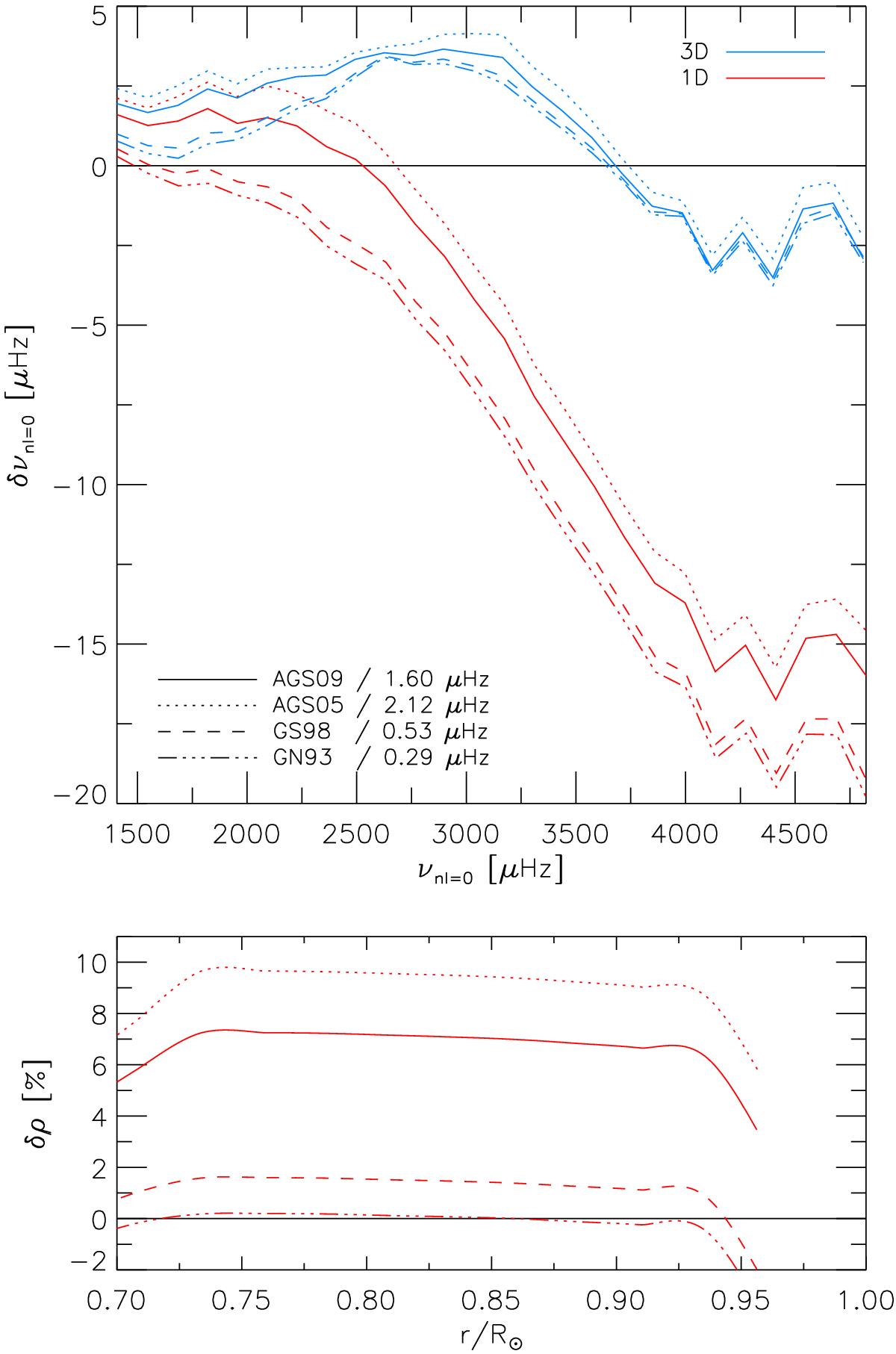
Top panel: similar to Fig. 5a, but showing models with different abundances. Shown are uncorrected 1D models (red lines) and 3D-corrected models (blue lines). The latter are the different 1D models, but appended with the same 3D model, which is why they converge towards higher frequencies and differ towards lower frequencies. We also note the low-frequency mismatch for the individual abundances. Bottom panel: differences in density compared to inferred ρ from observations (Basu et al. 2009).
Current usage metrics show cumulative count of Article Views (full-text article views including HTML views, PDF and ePub downloads, according to the available data) and Abstracts Views on Vision4Press platform.
Data correspond to usage on the plateform after 2015. The current usage metrics is available 48-96 hours after online publication and is updated daily on week days.
Initial download of the metrics may take a while.