Fig. 6
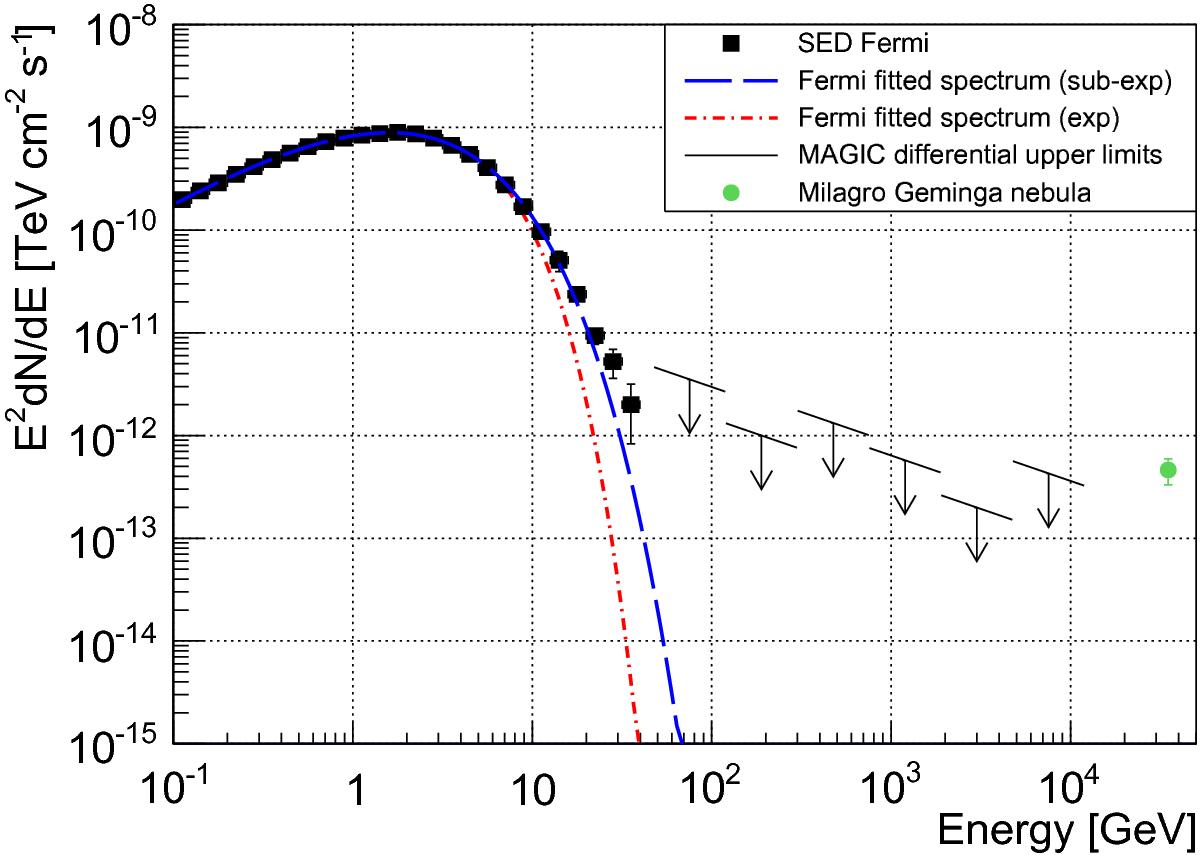
Phase-averaged spectral energy distribution. The differential upper limits are represented by the black arrows. The blue dashed line represents the SED computed using five years of Fermi-LAT data assuming a SEC function, between 100 MeV and 100 GeV. The green point represents the flux level of the Geminga nebula as seen by MILAGRO.
Current usage metrics show cumulative count of Article Views (full-text article views including HTML views, PDF and ePub downloads, according to the available data) and Abstracts Views on Vision4Press platform.
Data correspond to usage on the plateform after 2015. The current usage metrics is available 48-96 hours after online publication and is updated daily on week days.
Initial download of the metrics may take a while.