Fig. 2
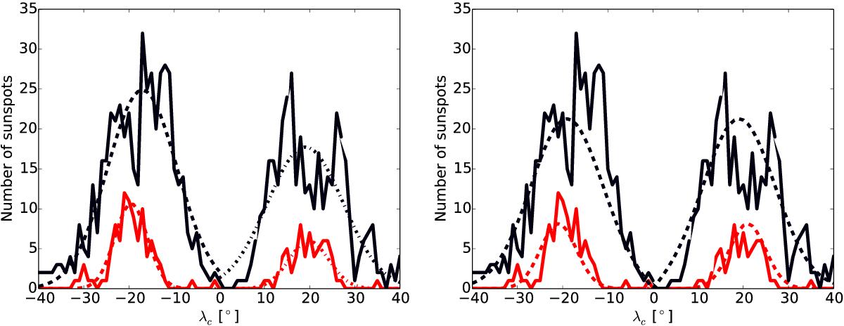
Latitudinal cuts through the butterfly diagram shown in Fig. 1 for the years 1903 (during the weak cycle 14, solid red curve) and 1957 (during the strong cycle 19, solid black curve). In the left panel, the dashed (dash-dotted) curve represents a Gaussian fit to the number of spot groups in the southern (northern) hemisphere. In the right panel, the two hemispheres were fitted together with a single Gaussian.
Current usage metrics show cumulative count of Article Views (full-text article views including HTML views, PDF and ePub downloads, according to the available data) and Abstracts Views on Vision4Press platform.
Data correspond to usage on the plateform after 2015. The current usage metrics is available 48-96 hours after online publication and is updated daily on week days.
Initial download of the metrics may take a while.